

In the previous article, we have created our interactive product details page using different MudBlazor components (Panel, Chart, Rating, etc). As a continuation, in this article, we are going to use the Blazor Material Form component, to create a form that handles product creation logic. We are going to add a file upload functionality to our form and show some messages using Dialog and Snackbar components. Of course, we are going to utilize our Web API project to handle POST requests (product creation and file upload) that we send from the client application.
If you want to learn more about Blazor WebAssembly, we strongly suggest visiting our Blazor WebAssembly series of articles, where you can read about Blazor WebAssembly development, authentication, authorization, JSInterop, and other topics as well.
Let’s start.
Adding Blazor Material Form to Our Project
Before we start working on this feature, we want to mention that if you are not familiar with Blazor WebAssembly forms, we strongly suggest reading our Blazor WebAssembly Forms and Validations article. Since in that article, you can find a lot of information regarding forms and form validations, we are not going to dive deep into explanations here.
That said, we can start creating our form.
Let’s start with the IHttpClientRepository interface modification:
public interface IHttpClientRepository
{
    Task<PagingResponse<Product>> GetProducts(ProductParameters productParameters);
    Task<Product> GetProduct(Guid id);
    Task CreateProduct(Product product);
}
Next, we have to implement this method in the HttpClientRepository class:
public async Task CreateProduct(Product product)
    => await _client.PostAsJsonAsync("products", product);
That’s it regarding the repository part.
Adding CreateProduct Component
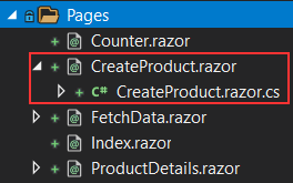
We can continue by creating two new files (CreateProduct.razor and CreateProduct.razor.cs) under the Pages folder:
To create our component, we are going to use the Product model class decorated with the validation attributes, which you can find in the Entities folder:
public class Product
{
    public Guid Id { get; set; }

    [Required(ErrorMessage = "Name is required.")]
    public string Name { get; set; }

    [Required(ErrorMessage = "Supplier is requied.")]
    public string Supplier { get; set; }

    [Required(ErrorMessage = "Price is required.")]
    [Range(5, 1000, ErrorMessage = "Price must be between 5 and 1000.")]
    public double Price { get; set; }
    public string ImageUrl { get; set; }
    public DateTime ManufactureDate { get; set; }
}
Now, let’s modify the class file in the same way we did in our Blazor Forms and FormValidations article:
public partial class CreateProduct
{
    private Product _product = new Product();
    private DateTime? _date = DateTime.Today;

    [Inject]
    public IHttpClientRepository Repository { get; set; }

    private async Task Create()
    {
        _product.ManufactureDate = (DateTime)_date;
        await Repository.CreateProduct(_product);
    }
}
So, we initialize a new product variable to bind to our form fields. Additionally, we create a nullable date-time variable to bind our Datepicker component. Furthermore, we inject the repository property and create a single method, which we are going to execute if the form is valid.
After that, we can prepare our template:
@page "/createProduct"

<section style="width:600px; margin: 0 auto;">
    <EditForm Model="_product" OnValidSubmit="Create">
        <DataAnnotationsValidator />
        <MudCard>
            <MudCardContent>
                <MudTextField Label="Product Name" @bind-Value="_product.Name"
                              For="@(() => _product.Name)" />
                <MudTextField Label="Supplier" @bind-Value="_product.Supplier"
                              For="@(() => _product.Supplier)" />
                <MudTextField Label="Price" @bind-Value="_product.Price" HelperText="Between 5 and 1000"
                              Adornment="Adornment.Start" AdornmentIcon="@Icons.Filled.AttachMoney"
                              InputType="InputType.Number" For="@(() => _product.Price)" />
                <MudDatePicker Label="Manufacture date" @bind-Date="_date" />
            </MudCardContent>
            <MudCardActions>
                <MudButton ButtonType="ButtonType.Submit" Variant="Variant.Filled" Color="Color.Primary"
                           Class="ml-auto">Create Product</MudButton>
            </MudCardActions>
        </MudCard>
    </EditForm>
</section>
First, we create a route to this page, and a single section below it, which we place on the center of the screen with 600px width. Since we use validation attributes with the Product model class, we use an EditForm component to create a form. We also use the DataAnnotationsValidator component to enable validation and the For expression for each field that needs validation. So, as you can see, the validation process is the same as with the regular Blazor project, as we explained in our article.
You can see that we use the MudCard component as a wrapper for our entire form, with the MudCardContent and the MudCardActions components. Inside the content part, we have three text fields and a single date picker. Additionally, inside the card actions part, we have our Create Product button. For the validation part, it is very important that the button is ButtonType.Submit.
Enabling Navigation to This Page
Before we inspect how this page looks like, we have to enable our users to navigate to this page.
To do that, we are going to add a navigation link above the table inside the FetchData.razor file:
<MudTooltip Text="Create Product">
    <MudLink Href="/createProduct">
        <MudFab Icon="@Icons.Filled.Add" Color="Color.Secondary" Size="Size.Large" />
    </MudLink>
</MudTooltip>
Here we use the MudTooltip component to create a tooltip once we hover over the link. Additionally, we create the link itself and decorate it with an icon.
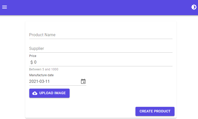
Now, we can start the app, and navigate to the FetchData page:
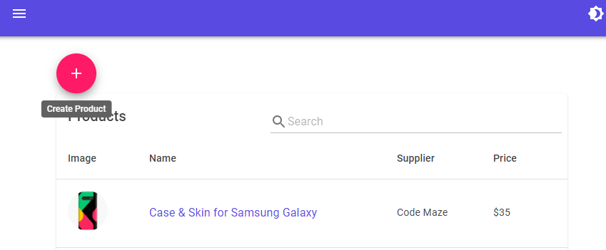
Once we click the link, we are going to see our new page:
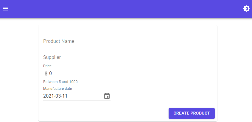
Excellent.
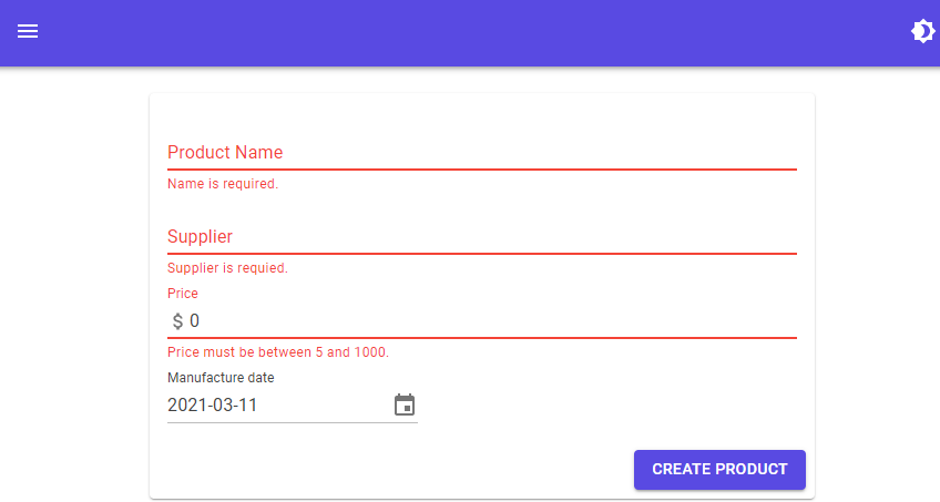
If we try to click the Create Product button without populating the required fields, we are going to see our validation works:
With all this in place, we are able to create a new product. But, we are not going to do that now. We want to add some more functionalities to this form.
Including a File Upload Functionality to Blazor Material Form
Before we start working on this functionality, we want to mention that we have prepared everything on the Web API side to support file upload. Additionally, we are going to use the steps that we used in our Blazor WebAssembly File Upload article, so we strongly suggest reading it to obtain more information about the process itself. Also, if you want to upload your files to Azure, you can read our File Upload to Azure with Blazor WASM and Web API article.
Repository Logic
Let’s start by modifying the IHttpClientRepository interface:
public interface IHttpClientRepository
{
    Task<PagingResponse<Product>> GetProducts(ProductParameters productParameters);
    Task<Product> GetProduct(Guid id);
    Task CreateProduct(Product product);
    Task<string> UploadImage(MultipartFormDataContent content);
}
To support MultipartFormDataContent, we have to add the System.Net.Http namespace.
Then, we can modify the repository class:
public async Task<string> UploadImage(MultipartFormDataContent content)
{
    var postResult = await _client.PostAsync("upload", content);
    var postContent = await postResult.Content.ReadAsStringAsync();

    var imgUrl = Path.Combine("https://localhost:5011/", postContent);

    return imgUrl;
}
Good.
Let’s move on to the component creation.
Creating ImageUpload Component
We are going to create two new files (ImageUpload.razor and ImageUpload.razor.cs) inside the Components folder.
Let’s first modify the .razor file:
<InputFile id="fileInput" OnChange="UploadImage" hidden />

<MudButton HtmlTag="label" Variant="Variant.Filled"
           Color="Color.Primary" StartIcon="@Icons.Filled.CloudUpload"
           Class="my-3" for="fileInput">
    Upload Image
</MudButton>

@if (ImgUrl != null)
{
    <div>
        <img src="@ImgUrl" style="width:300px" />
    </div>
}
To create an upload component that looks like the material one, we have to use the InputFile component, add an id attribute, assign the method to the OnChange event and hide this component. Then, we use the MudButton component with the HtmlTag="label" expression, to create a label that appears as a button. In the same component, we use several properties like Variant, Color, StartIcon, and Class to style our label, and we use the for attribute that points to the id attribute of the InputFile component. By using the for attribute, we can trigger the input component by clicking on the label.
Below our button label, we create a section to display our uploaded image.
Next, we can modify the ImageUpload.razor.cs file:
public partial class ImageUpload
{
    public string ImgUrl { get; set; }
    [Parameter]
    public EventCallback<string> OnChange { get; set; }
    [Inject]
    public IHttpClientRepository Repository { get; set; }

    private async Task UploadImage(InputFileChangeEventArgs e)
    {
        var imageFiles = e.GetMultipleFiles();
        foreach (var imageFile in imageFiles)
        {
            if (imageFile != null)
            {
                var resizedFile = await imageFile.RequestImageFileAsync("image/png", 300, 500);

                using (var ms = resizedFile.OpenReadStream(resizedFile.Size))
                {
                    var content = new MultipartFormDataContent();
                    content.Headers.ContentDisposition = new ContentDispositionHeaderValue("form-data");
                    content.Add(new StreamContent(ms, Convert.ToInt32(resizedFile.Size)), "image", imageFile.Name);
                    ImgUrl = await Repository.UploadImage(content);
                    await OnChange.InvokeAsync(ImgUrl);
                }
            }
        }
    }
}
Here we trigger a method as soon as we select the image to upload. Basically, this is the same logic as in the Blazor WebAssembly File Upload article (.NET 5 section). So, we prepare the content, call the repository method, and trigger our OnChange event callback with the image URL.
Now, we have to call this component in the CreateProduct.razor file:
<MudDatePicker Label="Manufacture date" @bind-Date="_date" />
<br/>
<ImageUpload OnChange="SetImgUrl"/>
And to add one more method in the CreateProduct.razor.cs file:
private void SetImgUrl(string imgUrl) => _product.ImageUrl = imgUrl;
That’s it.
We can start the app and navigate to the CreateProduct page:
As soon as we click the upload button and select the image to upload, we are going to see our uploaded image on the same form:
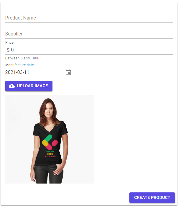
Excellent.
Again, at this point, you can populate all the other fields on the form and press the Create Product button. It will create a new product in the database. But, before we do that, we want to provide some sort of notifications for our users.
So, let’s do that.
Adding Notifications Using Snackbar and Dialog Material Components
As this section’s title states, we are going to use two different components to create our notifications. We are going to use the Snackbar component to add the notification once the image upload is finished. Furthermore, we are going to use the Dialog component to create a notification when we create a new product.
The Snackbar component depends on the ISnackbar service and MudSnackbarProvider. We have already registered the ISnackbar service in our first article of these series in the Program class by calling the AddMudService method. So, that means we only need to add MudSnackbarProvider in the MainLayout.razor file below the MudThemeProvider:
@inherits LayoutComponentBase

<MudLayout>
    <AppBar OnSidebarToggled="ToggleSidebar" OnThemeToggled="ToggleTheme" />

    <NavMenu SideBarOpen="_sidebarOpen" />

    <MudMainContent Class="pt-16 px-16">
        <MudContainer Class="mt-6">
            @Body
        </MudContainer>
    </MudMainContent>
</MudLayout>

<MudThemeProvider Theme="_currentTheme" />
<MudSnackbarProvider />
...
When we use the Snackbar component, we can create different variations of it, and that depends on the provided configuration. We can create a configuration in two ways using the global configuration or separately for each snack bar. For more information about this component, you can read the official documentation. In our case, we are going to use a global configuration by modifying the AddMudService method:
builder.Services.AddMudServices(config =>
{
    config.SnackbarConfiguration.PositionClass = Defaults.Classes.Position.TopRight;
    config.SnackbarConfiguration.SnackbarVariant = Variant.Filled;
    config.SnackbarConfiguration.ShowCloseIcon = true;
    config.SnackbarConfiguration.MaxDisplayedSnackbars = 1;
});
These are just several self-explanatory properties that we configure as a global configuration for our Snackbar component. You can find a lot more of these properties and feel free to explore them even further.
Then, we are going to inject the ISnackbar interface inside the ImageUpload.razor.cs file:
[Inject]
public ISnackbar Snackbar { get; set; }
And call our snack bar once the upload action is finished:
private async Task UploadImage(InputFileChangeEventArgs e)
{
    var imageFiles = e.GetMultipleFiles();
    foreach (var imageFile in imageFiles)
    {
        ...
    }

    Snackbar.Add("Image uploaded successfully.", Severity.Info);
}
That’s it.
We can start our app and try uploading a single image:
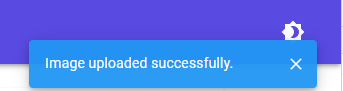
As soon as we upload it, we are going to see our snack bar notification.
Adding a Dialog Notification
To use the Dialog component in our project, we have to register the IDialogService interface, which we already did with the AddMudServices method, and add the MudDialogProvider in the MainLayout.razor file:
<MudThemeProvider Theme="_currentTheme" />
<MudSnackbarProvider />
<MudDialogProvider />
As with the Snackbar component, we can set up the configuration globally by modifying the MudDialogProvider component, or locally for each dialog in our project. For our example, we are going to use a global configuration:
<MudDialogProvider Position="DialogPosition.Center" CloseButton="true"
    DisableBackdropClick="true" />
Here we state that we want to position our dialogs at a center of a screen, add a close button, and disable backdrop click to close the dialog.
Now, in the Shared folder, we are going to create a new component named DialogNotification:
<MudDialog>
    <DialogContent>
        @Content
    </DialogContent>
    <DialogActions>
        <MudButton Color="@ButtonColor" Variant="Variant.Filled" OnClick="Submit">@ButtonText</MudButton>
    </DialogActions>
</MudDialog>

@code {
    [CascadingParameter]
    public MudDialogInstance MudDialog { get; set; }

    [Parameter]
    public string Content { get; set; }
    [Parameter]
    public string ButtonText { get; set; }
    [Parameter]
    public Color ButtonColor { get; set; }

    private void Submit() =>
        MudDialog.Close(DialogResult.Ok(true));
}
This file contains only one component MudDialog, where we specify the section for the dialog content and for the dialog actions. In the @code part, we have to create a MudDialog instance, which we can use to close the dialog, add different options, etc. Additionally, we create a couple of parameters like Content, ButtonText, and ButtonColor, and we also create a single method that closes the dialog and returns a result to the dialog caller.
After this, we can modify the CreateProduct.razor.cs file:
public partial class CreateProduct
{
    private Product _product = new Product();
    private DateTime? _date = DateTime.Today;

    [Inject]
    public IHttpClientRepository Repository { get; set; }
    [Inject]
    public IDialogService Dialog { get; set; }
    [Inject]
    public NavigationManager NavManager { get; set; }

    private async Task Create()
    {
        _product.ManufactureDate = (DateTime)_date;
        await Repository.CreateProduct(_product);
        await ExecuteDialog();
    }

    private async Task ExecuteDialog()
    {
        var parameters = new DialogParameters
        {
            { "Content", "You have successfully created a new product." },
            { "ButtonColor", Color.Primary },
            { "ButtonText", "OK" }
        };

        var dialog = Dialog.Show<DialogNotification>("Success", parameters);

        var result = await dialog.Result;
        if(!result.Cancelled)
        {
            bool.TryParse(result.Data.ToString(), out bool shouldNavigate);
            if (shouldNavigate)
                NavManager.NavigateTo("/fetchdata");
        }
    }

    private void SetImgUrl(string imgUrl) => _product.ImageUrl = imgUrl;
}
Here, we inject the required IDialogService and the NavigationManager service to be able to navigate our users to the FetchData page once they create a new product. Then we call the ExecuteDialog method, which will show the dialog. In that method, we prepare our parameters (Content, ButtonColor, and ButtonText) and call the Show method to show the dialog. We use the generic version of the Show method, where we provide the name of our dialog class as a type. Additionally, we provide the header text and our parameters as arguments.
Once we click the Ok button on the dialog, it will emit the result to the dialog variable. From that variable, we can extract the result. If it is not canceled, we can extract the data and parse it to the required type. We can return any data type from our dialog, but in this case, we use the boolean value. So, we check if the data is true, and if it is, we navigate our users to the FetchData page.
Testing
To test this, let’s start our application, navigate to the CreateProduct page, populate all the required fields, upload the image if you want, and press the Create Product button:
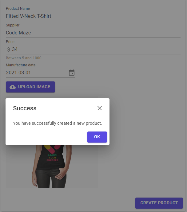
As soon as the create action finishes successfully, we can see our dialog confirmation.
Once we click the OK button, the application will navigate us to the FetchData page where we can search for our new product:
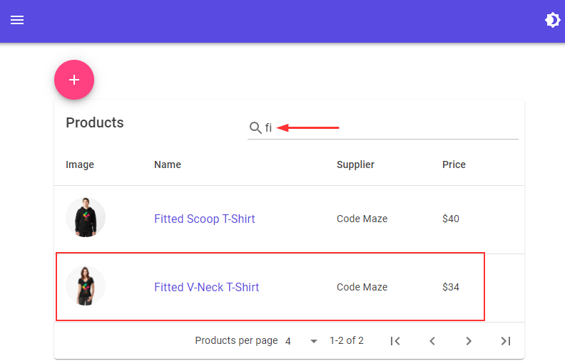
Excellent.
We have everything in place.
Conclusion
That’s it. We have covered a lot of ground here and in all of our previous articles. With this in place, we’ve learned a lot about MudBlazor components and how to use them to create a nice-looking web application that consumes our ASP.NET Core Web API.
So, until the next article.
Best Regards.