

In the previous article, we saw how to use the Blazor material table to display all the data fetched from the API, and how to apply pagination, searching, and sorting actions. But in real-world applications, we want to see more information about a single product, once we click on it. Well, in this article, we are going to use additional MudBlazor material components to create such a page. We are going to use Grid, Charts, Expansion Panel, Rating, and other components to accomplish our task. As in the previous article, we have already prepared our Web API project so we can focus only on the Blazor WebAssembly project and MudBlazor material components implementation.
If you want to learn more about Blazor WebAssembly, we strongly suggest visiting our Blazor WebAssembly series of articles, where you can read about Blazor WebAssembly development, authentication, authorization, JSInterop, and other topics as well.
Let’s start.
Fetching Data From the API
Before we start with the client application’s work, we have to run our API project. This will seed the additional data to our database, or create a new one with all the data if you didn’t follow along with our previous article.
Now, we can move on to the client application. Here, we want to start with the IHttpClientRepository modification:
public interface IHttpClientRepository
{
    Task<PagingResponse<Product>> GetProducts(ProductParameters productParameters);
    Task<Product> GetProduct(Guid id);
}
When we click on a single product, we want to call this GetProduct method and pass the product’s id as an argument. Of course, we have to implement it in the HttpClientRepository class:
public async Task<Product> GetProduct(Guid id)
{
    var uri = $"products/{id}";

    using (var response = await _client.GetAsync(uri))
    {
        response.EnsureSuccessStatusCode();

        var stream = await response.Content.ReadAsStreamAsync();

        var product = await JsonSerializer.DeserializeAsync<Product>(stream, _options);

        return product;
    }
}
Here we use the HttpClient to fetch the data from the API’s action and read the content as a stream. Then we deserialize our stream and return the product.
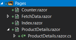
With this out of the way, we can start creating our ProductDetails page. We are going to create two files ProductDetails.razor and ProductDetails.razor.cs in the Pages folder:
Now, let’s just add the route to the template file by providing a single productId parameter:
@page "/product/{productId:guid}"
If you are not familiar with this logic or routing overall, we strongly suggest reading our Blazor WebAssembly Routing article.
Additionally, we have to modify the class file:
public partial class ProductDetails
{
    public Product Product { get; set; } = new Product();

    [Inject]
    public IHttpClientRepository Repository { get; set; }

    [Parameter]
    public Guid ProductId { get; set; }

    protected async override Task OnInitializedAsync()
    {
        Product = await Repository.GetProduct(ProductId);
    }
}
Here, we inject our repository service and provide a single parameter to accept the ProductId value from the route. Then, we call the GetProduct method from the repository to fetch that product from the API.
Providing Navigation Link
To be able to navigate to our ProductDetails page, we have to modify the FetchData.razor file:
<RowTemplate>
    <MudTd DataLabel="Image">
        <MudLink Href="@($"product/{context.Id}")">
            <MudAvatar Color="Color.Transparent" Size="Size.Large" Image="@context.ImageUrl" />
        </MudLink>
    </MudTd>
    <MudTd DataLabel="Name">
        <MudLink Href="@($"product/{context.Id}")">@context.Name</MudLink>
    </MudTd>
    <MudTd DataLabel="Supplier">@context.Supplier</MudTd>
    <MudTd DataLabel="Price">[email protected]</MudTd>
</RowTemplate>
We use the MudLink component to enable navigation to our ProductDetials page. We wrap the image and the name of the product with the link and provide the route to the page. The Href property accepts only a string type value, so we have to use the string interpolation to provide that value.
That’s all. We can start the app, and navigate to the FetchData page:
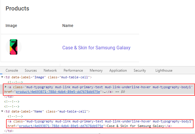
As we can see, both the image and the name are links now. Also, we can confirm that the href attribute contains a valid route.
Now, we can start using some MudBlazor material components to display our product details on the page.
Using MudBlazor Material Components to Display Product’s Details
Let’s start with displaying basic info about our product by modifying the ProductDetails.razor file:
@page "/product/{productId:guid}"

<MudGrid>
    <MudItem md="12" sm="12">
        <MudText Typo="Typo.h3">@Product.Name</MudText>
    </MudItem>
    <MudItem md="12" sm="12">Rating Placeholder</MudItem>
    <MudItem lg="4" md="6" sm="12">
        <img width="300" src="@Product.ImageUrl" alt="@Product.Name" />
    </MudItem>
    <MudItem lg="4" md="6" sm="12">
        <MudPaper Class="pa-4">
            <MudText Typo="Typo.h4" Class="mb-4">Price: [email protected]("{0:0.00}", Product.Price)</MudText>
            <MudText Typo="Typo.body1">
                <strong>Manufacture date:</strong> @Product.ManufactureDate.ToShortDateString()
            </MudText>
            <MudText Typo="Typo.body1" Class="mb-4"><strong>Supplier: </strong>@Product.Supplier</MudText>

            <MudIcon Icon="@Icons.Filled.LocalShipping" Size="Size.Large" />
            <MudElement HtmlTag="span" Style="position:relative; top:-13px; margin-left:5px;">
                Free shipping for this product.
            </MudElement>
            <MudFab Icon="@Icons.Filled.ShoppingCart" Color="Color.Tertiary"
                    Label="Add to cart" Class="mt-4"/>
        </MudPaper>
    </MudItem>
</MudGrid>
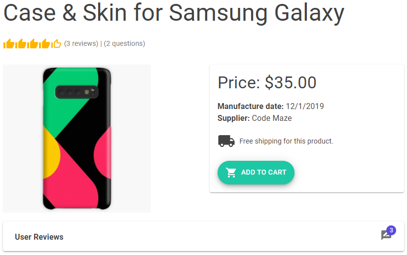
Here, we use the MudGrid component to prepare a layout for our items. We create each item with the MudItem component. You can also see that we use different breakpoints like lg, md, and sm. These breakpoints enable our items to spread equally on our page depending on the page size. You can read more about these breakpoints on this link.
So, we first create a title with our product’s name, and below a simple placeholder for our rating component, which we are going to implement pretty soon. Then, we create an image, which takes 1/4 of the large screen size, 1/2 of the medium screen size, and the entire small screen size. We use the same breakpoints for the next item, which is a more complex one. In this one, we use a MudPaper component to create a simple wrapper with some shadow and borders around our content. Then, we show different details of our product, including the free shipping information, and the cart button.
We can see two new components here: MudElement and MudFab. The first one enables us to render any HTML element we want to use on our page. In this case, we use the span element. The second one renders the button with an additional label.
Now, if we start our app, and click on the first product (because we’ve seeded the data only for that one), we can see our page:
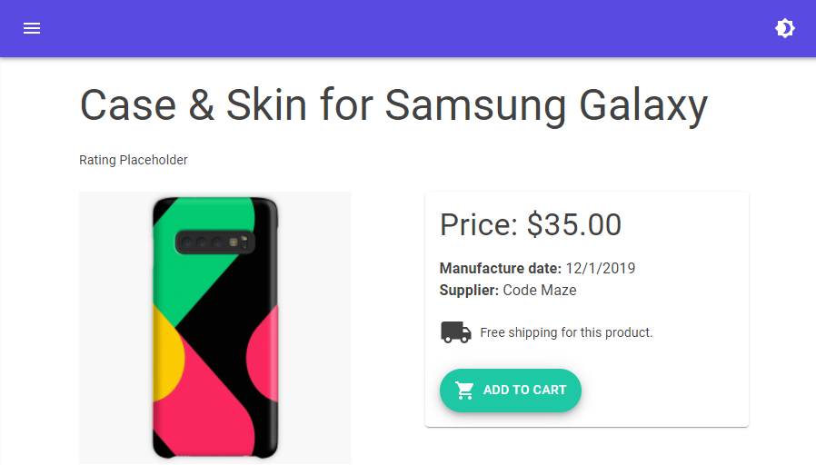
Excellent.
Let’s now add the rating part.
Adding Rating MudBlazor Component
To add rating functionality to our product, we are going to use the MudRating component in the ProductDetails.razor file. Let’s replace the rating placeholder text with a real component:
<MudGrid>
    <MudItem md="12" sm="12">
        <MudText Typo="Typo.h3">@Product.Name</MudText>
    </MudItem>
    <MudItem md="12" sm="12">
        <MudRating SelectedValue="@_currentRating" Size="Size.Medium" FullIcon="@Icons.Filled.ThumbUp"
                   EmptyIcon="@Icons.Filled.ThumbUpOffAlt" SelectedValueChanged="RatingValueChanged"/>
        <MudElement HtmlTag="span" Style="position:relative; top:-8px; color:gray;">
            (@_reviewCount reviews) | (@_questionCount questions)
        </MudElement>
    </MudItem>
...
Our MudRating component has various properties that we can use for reacting to events and component styling. The SelectedValue property accepts an integer, in the current case from 1 to 5, to show the total rate for the product. By default, the max number is 5, but we can change that by using the MaxValue property. We use the Size property to determine the size of our component and we also use thumb up/down icons to display values of the rating component. Finally, with the SelectedValueChanged event callback, this component will call the RatingValueChanged method every time the SelectedValue changes. You can also see, that we use the MudElement control again to show some additional info next to the rating component.
Since we are using fields and methods, which we didn’t create yet, we have to modify the ProductDetails.razor.cs file and add them:
public partial class ProductDetails
{
    public Product Product { get; set; } = new Product();

    [Inject]
    public IHttpClientRepository Repository { get; set; }

    [Parameter]
    public Guid ProductId { get; set; }

    private int _currentRating;
    private int _reviewCount;
    private int _questionCount;

    protected async override Task OnInitializedAsync()
    {
        Product = await Repository.GetProduct(ProductId);
        _reviewCount = Product.Reviews.Count;
        _questionCount = Product.QAs.Count;
        _currentRating = CalculateRating();
    }

    private int CalculateRating()
    {
        var rating = Product.Reviews.Any() ? Product.Reviews.Average(r => r.Rate) : 0;
        return Convert.ToInt32(Math.Round(rating));
    }

    private void RatingValueChanged(int value) =>
        Console.WriteLine($"The product is rated with {value} thumbs.");
}
Here we have a private field to store the values for the current rating, number of reviews, and number of questions. We populate these as soon as our component initializes. We also have two methods: CalculateRating and RatingValueChanged. The first one calculates the current rating from all the reviews that we fetch from the database, and the second one is our method that we call every time SelectedValue changes.
Now, let’s inspect our result:
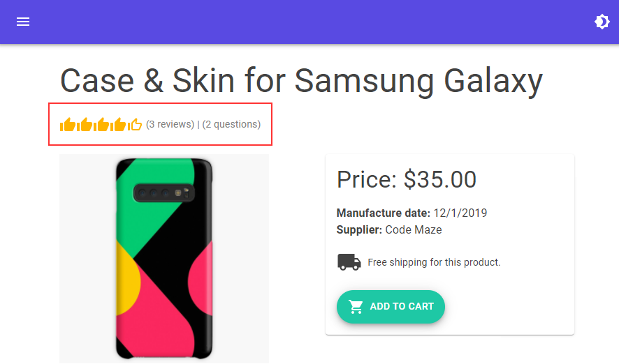
And there we go. Our rating component looks great.
Including Additional Product’s Information with Expansion Panel
The first thing we are going to do here is to create three new files (AdditionalProductInfo.razor, AdditionalProductInfo.razor.cs and Reviews.razor) in the Components folder.
Then, let’s slightly modify the Product property in the ProductDetails.razror.cs file:
public Product Product { get; set; } = new Product
{
    Reviews = new List<Review>(),
    Declaration = new Declaration(),
    QAs = new List<QA>()
};
We have to add this modification to avoid an object reference exception when using any of these properties in our AdditionalProductInfo component.
Now, let’s start with the AdditionalProductInfo.razor.cs file modification:
public partial class AdditionalProductInfo
{
    [Parameter]
    public Product Product { get; set; }
    [Parameter]
    public int ReviewCount { get; set; }
    [Parameter]
    public int QuestionCount { get; set; }
}
These all are just simple parameters that we are going to accept from the parent – ProductDetails – component.
Next, we are going to modify the AdditionalProductInfo.razor file:
<MudGrid>
    <MudItem lg="8" md="12" sm="12">
        <MudExpansionPanels Elevation="2">
            <MudExpansionPanel HideIcon="true">
                <TitleContent>
                    <div class="d-flex">
                        <MudText Class="mt-1"><strong>User Reviews</strong></MudText>
                        <MudBadge Content="ReviewCount" Color="Color.Primary" Overlap="true" Class="d-flex ml-auto">
                            <MudIcon Icon="@Icons.Material.Filled.RateReview" Color="Color.Default" />
                        </MudBadge>
                    </div>
                </TitleContent>
                <ChildContent>
                    <Reviews UserReviews="Product.Reviews" />
                </ChildContent>
            </MudExpansionPanel>
        </MudExpansionPanels>
    </MudItem>
</MudGrid>
Here, inside the MudGrid component, we use the MudExpansionPanels component with a single MudExpansionPanel component (we will add more later on). Inside it, we create title content to show user reviews with some text, a badge that will show the number of reviews, and a single icon. Also, we show a child content by using our additional Reviews component. For this to work, we have to modify the Reviews.razor file:
@using Entities.Models;

<MudGrid Class="mb-4">
    @foreach (var review in UserReviews)
    {
            <MudItem md="3">
                <MudText Typo="Typo.h4">@review.Rate.ToString(" 0.0 ")</MudText>
                <MudText Typo="Typo.body2" Class="mt-1 mb-2">@review.User</MudText>
                <MudProgressLinear Color="Color.Secondary" Value="review.Rate" Min="1" Max="5" />
            </MudItem>
            <MudItem md="6">
                <MudText Typo="Typo.body2" Class="mt-4">@review.Comment</MudText>
            </MudItem>
    }
</MudGrid>

@code {
    [Parameter]
    public ICollection<Review> UserReviews { get; set; }
}
All the components, in this file, are familiar to us except the MudProgressLinear component. We use it here just to show the linear representation of a product’s rate.
Finally, we have to call the AdditionalProductInfo component inside the ProductDetails.razor file just below the MudGrid component:
<AdditionalProductInfo Product="Product" ReviewCount="_reviewCount" QuestionCount="_questionCount" />
That’s it.
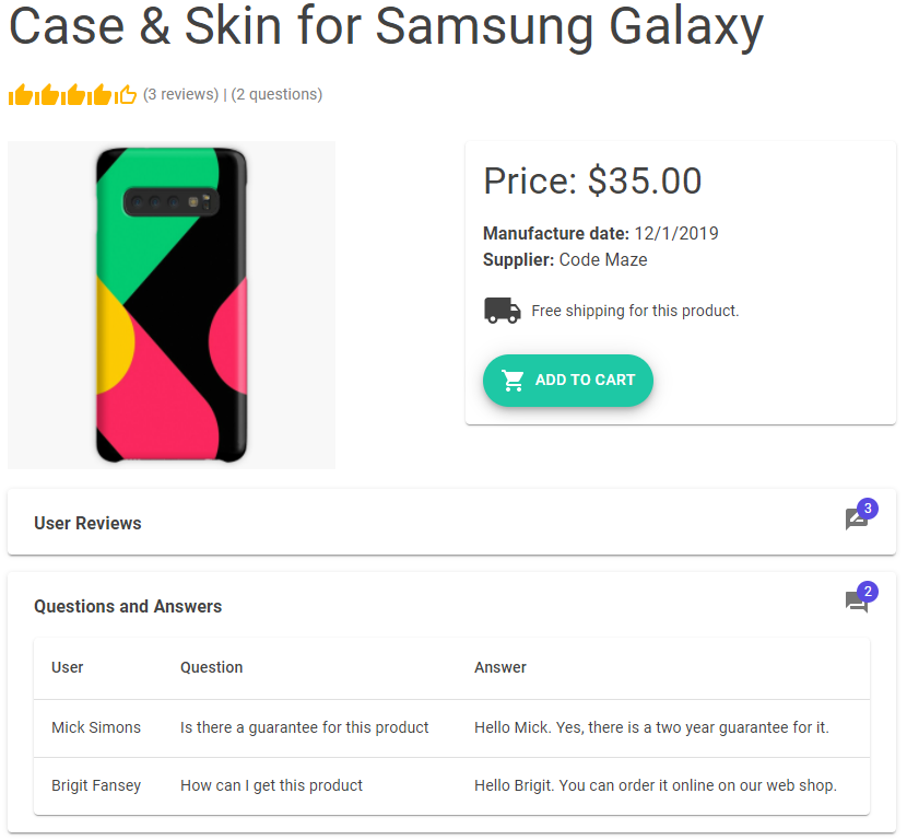
We can start our app, and click the first product in the list:
Also, as soon as we expand the Expansion Panel:

We can see our reviews.
Awesome.
Let’s move on and add two more panels.
Additional Panels for Questions and Declaration
We are going to expand the MudExpansionsPanel component with an additional panel in the AdditionalProductInfo.razor file:
<MudExpansionPanel HideIcon="true">
    <TitleContent>
        <div class="d-flex">
            <MudText Class="mt-1"><strong>Questions and Answers</strong></MudText>
            <MudBadge Content="QuestionCount" Color="Color.Primary" Overlap="true" Class="d-flex ml-auto">
                <MudIcon Icon="@Icons.Material.Filled.QuestionAnswer" Color="Color.Default" />
            </MudBadge>
        </div>
    </TitleContent>
    <ChildContent>
        <QuestionsAnswers QAs="Product.QAs" />
    </ChildContent>
</MudExpansionPanel>
So, nothing new here but we have to create our QuestionsAnswers component in the Components folder:
@using Entities.Models;

<MudTable Items="QAs" Hover="true" Breakpoint="Breakpoint.Sm">
    <HeaderContent>
        <MudTh>User</MudTh>
        <MudTh>Question</MudTh>
        <MudTh>Answer</MudTh>
    </HeaderContent>
    <RowTemplate>
        <MudTd DataLabel="User">@context.User</MudTd>
        <MudTd DataLabel="Question">@context.Question</MudTd>
        <MudTd DataLabel="Answer">@context.Answer</MudTd>
    </RowTemplate>
</MudTable>

@code {
    [Parameter]
    public ICollection<QA> QAs { get; set; }
}
As you can see, we are using a table component to show our data.
Now, let’s inspect the result:
Awesome.
The icon shows two comments, and we can see both of them in our panel.
Lastly, let’s add the declaration panel in the same way we did for the previous two panels.
To do that, we have to add a new panel:
<MudExpansionPanel>
    <TitleContent>
        <MudText Class="mt-1"><strong>Declaration</strong></MudText>
    </TitleContent>
    <ChildContent>
        <Declarations ProductDeclaration="Product.Declaration" />
    </ChildContent>
</MudExpansionPanel>
And create a new Declarations component:
@using Entities.Models;

@if (ProductDeclaration != null)
{
    <MudGrid>
        <MudItem lg="3" md="3" sm="12">
            <MudText Typo="Typo.body2"><strong>Model: </strong></MudText>
        </MudItem>
        <MudItem lg="9" md="9" sm="12">
            <MudText Typo="Typo.body2">@ProductDeclaration.Model</MudText>
        </MudItem>
        <MudItem lg="3" md="3" sm="12">
            <MudText Typo="Typo.body2"><strong>Origin: </strong></MudText>
        </MudItem>
        <MudItem lg="9" md="9" sm="12">
            <MudText Typo="Typo.body2">@ProductDeclaration.Origin</MudText>
        </MudItem>
        <MudItem lg="3" md="3" sm="12">
            <MudText Typo="Typo.body2"><strong>Customer rights: </strong></MudText>
        </MudItem>
        <MudItem lg="9" md="9" sm="12">
            <MudText Typo="Typo.body2">@ProductDeclaration.CustomerRights</MudText>
        </MudItem>
    </MudGrid>
}

@code {
    [Parameter]
    public Declaration ProductDeclaration { get; set; }
}
Great.
Let’s check our result:
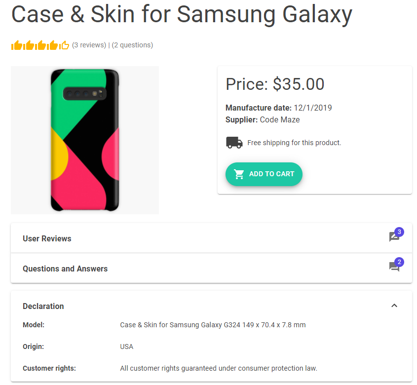
It looks great.
Using Charts in ProductDetails Page
As the last part of our page, we are going to add charts that will show information about the yearly sale of that exact product. Here, we won’t fetch the data from the API but we are going to simulate a local data storage that provides data for our charts.
That said, let’s start with the new DataStorage class creation in our client project:
public static class DataStorage
{
    public static (List<ChartSeries> ChartData, string[] Labels) GetChartData(string productName)
    {
        var chartData = new List<ChartSeries>
        {
            new ChartSeries
            {
                Name = productName,
                Data = new double[] { 23, 35, 52, 46, 40, 50 }
            }
        };

        var labels = new string[] { "Jan", "Feb", "Mar", "Apr", "May", "Jun" };

        return (chartData, labels);
    }
}
The line chart expects the list of ChartSeries containing the Name and Data properties, and also the string array for the labels. That’s exactly what we return from this class using the Tuple with named properties. We are going to use this method for the pie chart as well. It also expects a string array for labels, and a double array for the data, which we can extract from the ChartData property.
The next step is to create two files Charts.razor and Charts.razor.cs in the Components folder to display our charts.
Let’s first modify the Charts.razor.cs class:
public partial class Charts
{
    [Parameter]
    public string ProductName { get; set; }

    private bool _lineChartDisplayed = true;
    private List<ChartSeries> _lineChartSeries;
    private double[] _pieChartData;
    private string[] _chartLabels;

    private ChartOptions _lineChartOptions = new ChartOptions
    {
        YAxisLines = true
    };

    protected override void OnParametersSet()
    {
        var chartData = DataStorage.GetChartData(ProductName);
        _lineChartSeries = chartData.ChartData;
        _pieChartData = chartData.ChartData.Select(d => d.Data).First();
        _chartLabels = chartData.Labels;
    }

    private void SwitchChart() => _lineChartDisplayed = !_lineChartDisplayed;
}
Here, we create a public ProductName property and declare it as a parameter since the parent component is going to provide that for this component. Then, we create several private variables, which we are going to use in the HTML markup of this component. We are going to use the _lineChartDisplayed variable to switch between line and pie charts. Furthermore, we are going to use the _lineChartsSeries variable to provide the data for the line chart, _pieChartData variable to provide the data for the pie chart, and _chartLabels to provide the labels for both charts. Since we want to have Y-axis lines for the line chart, we state that in the line chart options configuration.
As an addition to these variables, we have two methods as well. In the OnParameterSet lifecycle method, we fetch the data from the fake storage and populate our variables. Additionally, in the SwitchChart method, we just enable switching between two charts.
Using the Chart Component in the HTML Template file
Once we are done with all the class modifications, we can proceed to the Charts.razor file modification:
<MudGrid Class="mt-3">
    <MudItem lg="6" md="6" sm="6">
        <MudText Typo="Typo.h4">Sales over the last six months</MudText>
    </MudItem>
    <MudItem>
        <MudButton OnClick="SwitchChart" Color="Color.Primary" Variant="Variant.Filled">Switch Chart</MudButton>
    </MudItem>
    @if (_lineChartDisplayed)
    {
        <MudItem lg="10" sm="12">
            <MudChart ChartType="ChartType.Line" ChartSeries="_lineChartSeries" XAxisLabels="_chartLabels"
                      ChartOptions="_lineChartOptions" />
        </MudItem>
    }
    else
    {
        <MudItem lg="8" sm="12">
            <MudChart ChartType="ChartType.Pie" InputData="_pieChartData" InputLabels="_chartLabels"
                      Width="300px" Height="300px" />
        </MudItem>
    }
</MudGrid>
Here, we create a title for the chart part of the page, create a button to switch between charts, and also show the charts themselves. To organize it on the screen, we use the MudGrid and MudItem components.
Now, we can start our app, navigate to the FetchData page and click the first product:
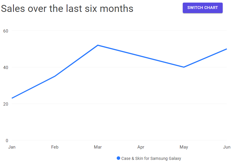
As you can see, in addition to all the other material components, we have the line chart as well. Moreover, if we click the Switch Chart button:
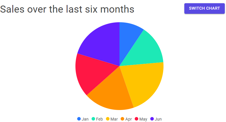
We are going to see the pie chart.
Excellent.
Now we have a complete product details page.
Conclusion
In this article, we have used a lot of different material components to create a nice looking and interactive product details page for our Blazor material application.
In the next one, we are going to learn how to use forms, dialogs, and upload components to create a user form for the product creation.
Until that one.
All the best.