

In this article, we are going to learn how to integrate MudBlazor inside the Blazor WebAssembly application, and thus create a Material UI Blazor project. We are not going to learn about Blazor WebAssembly itself. If you are not familiar with Blazor WebAssembly, we strongly recommend reading our Blazor WebAssembly series of articles. There, you can learn everything you need to develop great Blazor WebAssembly applications. In this article, and in all the articles from the Blazor Material UI series, we will try to convert the project created in our Blazor WebAssembly series to a material one by using material components from MudBlazor. Additionally, in this one, we are going to learn how to use themes to change the entire look of our application.
If you want to learn more about Blazor WebAssembly, we strongly suggest visiting our Blazor WebAssembly series of articles, where you can read about Blazor WebAssembly development, authentication, authorization, JSInterop, and other topics as well.
Let’s dive in.
Blazor Material UI Project Creation and MudBlazor Installation
Let’s start by creating a new Blazor WebAssembly standalone project and naming it BlazorMaterialUI:
Once the creation is done, we are going to install the MudBlazor library required for the material UI components:
PM> Install-Package MudBlazor -Version 5.0.6
As soon as installation finishes, we have to add a required using directive inside the _Imports.razor file:
@using MudBlazor
Since the MudBlazor relies on the predefined CSS and also Fonts, we have to add these references inside the index.html file:
<head>
    ...
    <link href="BlazorMaterialUI.styles.css" rel="stylesheet" />
    <link href="https://fonts.googleapis.com/css?family=Roboto:300,400,500,700&display=swap" rel="stylesheet" />
    <link href="_content/MudBlazor/MudBlazor.min.css" rel="stylesheet" />
</head>
Also, to support components that require JavaScript functionality, we have to add a reference to the MudBlazor.min.js file in the index.html:
<script src="_framework/blazor.webassembly.js"></script>
<script src="_content/MudBlazor/MudBlazor.min.js"></script>
In the documentation, we can find a recommendation to remove the bootstrap.min.css file and also all the styles from the app.css file. This should be done if we create a brand new Blazor project, which we do.
For this article, we are only going to remove the bootstrap.min.css file and leave the app.css as-is. We will remove it in the next article.
That said, let’s remove the bootstrap folder – since it contains only the bootstrap.min.css file – from the wwwroot folder:
Also, we can safely remove the bootstrap.min.css reference from our index.html file since we don’t need it anymore:
<link href="css/bootstrap/bootstrap.min.css" rel="stylesheet" />
Service Registration and Adding a Base Theme Component
What we want to do now is to register all the required services for the MudBlazor components. We can do that in the Program class:
public static async Task Main(string[] args)
{
    var builder = WebAssemblyHostBuilder.CreateDefault(args);
    builder.RootComponents.Add<App>("#app");

    builder.Services.AddScoped(sp => new HttpClient { BaseAddress = new Uri(builder.HostEnvironment.BaseAddress) });

    builder.Services.AddMudServices();

    await builder.Build().RunAsync();
}
For this method, we need to add a new using directive:
using MudBlazor.Services;
As you can see, we can register all the required services by just calling the AddMudServices method. This method encapsulates the registration of all the other required services for MudBlazorDialog, MudBlazorSnackbar, etc. We can see that in the method implementation:
public static IServiceCollection AddMudServices(this IServiceCollection services, MudServicesConfiguration configuration = null)
{
    if (configuration == null)
        configuration = new MudServicesConfiguration();
    return services
        .AddMudBlazorDialog()
        .AddMudBlazorSnackbar(configuration.SnackbarConfiguration)
        .AddMudBlazorResizeListener(configuration.ResizeOptions)
        .AddMudBlazorScrollManager()
        .AddMudBlazorScrollListener()
        .AddMudBlazorDom();
}
Additionally, we can see that the service configuration is set to a default one, but if we want, we can use another overload of this method to add our own custom configuration:
builder.Services.AddMudServices(config =>
{
    config.ResizeOptions = new ResizeOptions { ... };
    config.SnackbarConfiguration = new MudBlazor.SnackbarConfiguration { ... };
});
For the purpose of this project, we are going to leave the default configuration by just using the parameterless AddMudServices method.
To finish the configuration process, we are going to modify the MainLayout.razor component by adding a base theme component provider to the end of the file:
<MudThemeProvider />
We are using only the MudThemeProvider component because it is essential to MudBlazor. Of course, there are additional component providers like: <MudDialogProvider/> or <MudSnackbarProvider/>, but we will include these as soon as we need them.
Now, if we start our app, we will see that the styles are messed up. But this is normal since we have removed the bootstrap file. In the next article, we are going to fix the styling and create a new material navigation menu. For now, the important part is that our app starts and that everything works.
Let’s move on.
Creating a Home Component and Using MudText, MudPaper, and MudLink Components
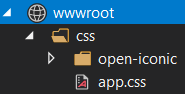
The first thing we are going to do is to create a new Components folder and inside a new Home.razor .
Also, we are going to create a new assets folder under the wwwroot and add a new image inside:
Now, let’s modify the Home.razor file to prepare our home page:
<MudText Align="Align.Center" Typo="Typo.h3" Color="Color.Primary">
    Welcome to a Code-Maze shop created with
    <br /> Blazor UI Material design.
</MudText>

<MudPaper Elevation="3" Class="my-5 py-5">
    <MudText Align="Align.Center">
        Feel free to
        <MudLink Href="https://www.redbubble.com/people/vpecanac/works/44764889-code-maze-merch?asc=u"
                 Target="_blank" Typo="Typo.h6">
            visit our shop
        </MudLink>
        any time you want.
    </MudText>
</MudPaper>

<p style="text-align:center;" >
    <img src="/assets/CodeMazeShopImage.png" alt="products image for the Home component" />
</p>

@code {

}
Let’s Explain This Code.
First, we use the MudText component to display our welcome text on the page. In that component, we use a couple of attributes. With the Align attribute, we are centering our text on the page. By using the Typo attribute, we specify that we want to render this text as an H3 element. Also, with the Color attribute, we specify the text’s color. On the official typography documentation, you can read more about the Typo and Align values.
Then, we use the MudPaper component, which represents a single box as a wrapper around the content. With the Elevation attribute, we specify the shadow around the box, and with the Class attribute, we can add our classes. In this example, we use predefined spacing classes for margin-top and bottom (my) and padding-top and bottom (py). Both are set to 20px. You can read the documentation for more explanation about Colors, Elevation, and Spacing. We also use the MudLink component, to display a link on the page.
Finally, we add our picture on the page.
Before we start the application, we have to import the Home component inside the Index.razor file:
@page "/"

<Home />
Now, let’s start our application, and inspect the result:

Great. Of course, as we said, the navigation menu doesn’t look good, but we will fix that in the next article.
Let’s now learn how to customize our default theme.
Theme Customization with Blazor Material UI
If you remember, we use the MudThemeProvider component, in the MainLayout.razor file, to make the MudBlazor components work properly. This theme provider provides all the default colors, sizes, shapes, and shadows for material components. But also, we can use it to make a custom theme in our project.
To do that, we are going to modify our MainLayout.razor file:
@inherits LayoutComponentBase

<div class="page">
    <div class="sidebar">
        <NavMenu />
    </div>

    <div class="main">
        <div class="top-row px-4">
            @if (_isLightMode)
            {
                <MudIconButton Icon="@Icons.Material.Filled.Brightness4" OnClick="@ToggleTheme" />
            }
            else
            {
                <MudIconButton Icon="@Icons.Material.Filled.Brightness5" OnClick="@ToggleTheme" />
            }
        </div>

        <div class="content px-4">
            @Body
        </div>
    </div>
</div>

<MudThemeProvider Theme="_currentTheme" />
Here, we conditionally render icons by using the MudIconButton component. To select the icon, we use the Icon property, and we also use the OnClick event to trigger the theme switching.
Lastly, we modify the MudThemeProvider component by adding a value for the Theme property.
With that in place, let’s add the @code part in the same file:
@code {
    private bool _isLightMode = true;
    private MudTheme _currentTheme = new MudTheme();

    private void ToggleTheme()
    {
        _isLightMode = !_isLightMode;

        if(!_isLightMode)
        {
            _currentTheme = GenerateDarkTheme();
        }
        else
        {
            _currentTheme = new MudTheme();
        }
    }

    private MudTheme GenerateDarkTheme() =>
        new MudTheme
        {
            Palette = new Palette()
            {
                Black = "#27272f",
                Background = "#32333d",
                BackgroundGrey = "#27272f",
                Surface = "#373740",
                TextPrimary = "#ffffffb3",
                TextSecondary = "rgba(255,255,255, 0.50)"
            }
        };
}
First, we state that the default mode is the light mode and that the current theme is the default theme. Then, in the ToggleTheme method, we change the current value of the _isLightMode variable. If the value is false, we generate the dark theme settings for the _currentTheme variable, otherwise, we set its value to the default theme. In the GenerateDarkTheme method, we create a new dark theme configuration. We use some of the properties from the Palette class, but after we add the navigation menu in the next article, we are going to expand this configuration.
Now, we can start the app, and as a default theme, we are going to see a light theme:

Also, we can see a new icon in the top nav menu.
As soon as we click that icon:

We will see that our app applies a new theme, and we can also see a different icon.
Of course, as soon as we click that icon again, we will apply a light theme again.
Conclusion
So, in this article, we have learned how to integrate MudBlazor with a new Blazor WebAssembly application to create the Material UI design for our app. Furthermore, we have learned more about different material components and also how to use the MudThemeProvider to customize material themes.
But, as we saw, our navigation menu doesn’t look good.
In the next article, we are going to create a new material navigation menu and replace the current one.
Until then.
All the best.