

Every application needs to have some sort of navigation, to provide users with a better experience.
Creating a navigation menu will be our goal in this article.
We have to use angular routing as well, and we are going to do that, but we won’t dive deep inside the routing concepts. If you want to learn in more detail about the angular routing, you can read Angular Navigation And Routing.
Because this series is all about angular material, this article won’t be an exception. We will focus on creating a navigation menu by using different material components. Once we are done, we will have a fully responsive and functional navigation menu with the routing logic to support the complete process.
VIDEO: Angular Material Complete Responsive Navigation video.
For the complete navigation and all the basic instructions of the Angular Material series, check out: Introduction of the Angular Material series.
We strongly recommend reading our Angular Series prior to reading this article if you want to restore your knowledge about that topic or to learn Angular development overall.
The source code is available at GitHub Angular Material Navigation Menu – Source Code
We are going to divide this post into several sections:
- Creating Routes
- Angular Material Navigation Development
- Creating Navigation Header
- Creating Side-Navigation
- Multi-Menu in Side-Nav
- Conclusion
Creating Routes
Let’s start with creating a new routing module:
ng g module routing --module app

A next step is to modify the routing.module.ts file:
import { NgModule } from '@angular/core';
import { CommonModule } from '@angular/common';
import { Routes, RouterModule } from '@angular/router';
import { HomeComponent } from '../home/home.component';

const routes: Routes = [
  { path: 'home', component: HomeComponent},
  { path: '', redirectTo: '/home', pathMatch: 'full' }

];

@NgModule({
  imports: [
    CommonModule,
    RouterModule.forRoot(routes)
  ],
  exports: [
    RouterModule
  ],
  declarations: []
})
export class RoutingModule { }
Finally, let’s modify the
app.compnent.html file to complete the routing part for now:<app-layout>
<main>
<router-outlet></router-outlet>
</main>
</app-layout>
We should be able to see our home component again, but this time it is served on the
/home route.
Angular Material Navigation Development
Angular Material provides different components that we can use to create nicely styled, responsive, and effective navigation in our app. But we need to start with something, don’t we? So, let’s start with the app.component.html file modification by using the mat-sidenav-container component:
<app-layout>
  <mat-sidenav-container>
    <mat-sidenav #sidenav role="navigation">
      <!--this is a place for us to add side-nav code-->
    </mat-sidenav>
    <mat-sidenav-content>
      <!--in here all the content must reside. We will add a navigation header as well-->
      <main>
        <router-outlet></router-outlet>
      </main>
    </mat-sidenav-content>
  </mat-sidenav-container>
</app-layout>
We create a container for a side navigation bar and specify the part for our content. As you can see the
<mat-sidenav> element defines a place for a side navigation and the <mat-sidenav-content>element defines a place for our content. We need to use the local reference #sidenav, and a little bit later, you will see why.Of course, this won’t work. We need to register the module in the material.module.ts file:
import { MatSidenavModule } from '@angular/material/sidenav';

@NgModule({
  imports: [
    CommonModule,
    MatTabsModule,
    MatSidenavModule
  ],
  exports: [
    MatTabsModule,
    MatSidenavModule
  ],
Now, we should have a working application again with some grayish background. Let’s style this a bit in the
app.component.css file:mat-sidenav-container, mat-sidenav-content, mat-sidenav {
height: 100%;
}
mat-sidenav {
width: 250px;
}
main {
padding: 10px;
}
And let’s modify the
styles.css file:/* for sidenav to take a whole page */
html, body {
margin: 0;
height: 100%;
}
That is it. We have all prepared and it is time to start working on our navigation header component.
Creating Navigation Header
To create a navigation header, we need to use the mat-toolbar element. But first thing first.
This component has its own module, so we need to register that module inside the material.module.ts file:
import { MatToolbarModule } from '@angular/material/toolbar';imports: [
MatToolbarModule,
exports: [
    MatToolbarModule,
After that, we are going to create a new header component:
ng g component navigation/header --skipTests
Now it is time to include this component inside the
app.component.html file, right above the <main> tag:<mat-sidenav-content>
<app-header></app-header>
<main>
<router-outlet></router-outlet>
</main>
</mat-sidenav-content>
Then, let’s modify the
header.component.html file:<mat-toolbar color="primary">
<div fxHide.gt-xs>
<button mat-icon-button (click)="onToggleSidenav()">
<mat-icon>menu</mat-icon>
</button>
</div>
<div>
<a routerLink="/home">Owner-Account</a>
</div>
<div fxFlex fxLayout fxLayoutAlign="end" fxHide.xs>
<ul fxLayout fxLayoutGap="15px" class="navigation-items">
<li>
<a routerLink="/owner">Owner Actions</a>
</li>
<li>
<a routerLink="/account">Account Actions</a>
</li>
</ul>
</div>
</mat-toolbar>
Basically, we create our navigation with the menu icon (we still need to register its own module), and the Owner-Account part that navigates to the home component. As you can see, we use the
fxHide.gt-xs directive, which states that this part should be hidden only on the screen that is greater than the extra small.
We have another part of a navigation which is positioned on the end of the navbar and hidden only for the extra small screen.
To continue, let’s register the MatIconModule and MatButtonModule inside the material module file:
import { MatIconModule } from '@angular/material/icon';
import { MatButtonModule } from '@angular/material/button';
imports: [
MatButtonModule,
MatIconModule,
exports: [
    MatButtonModule,
    MatIconModule,
Before we start the application, let’s just add the
onToggleSideNav function in the header.component.ts file:
public onToggleSidenav = () => {

}
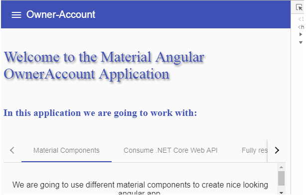
Right now, our menu looks like this:
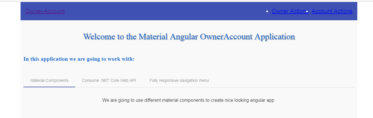
Looking beautiful right? 😀 😀
Of course not, but we have the starting functionality in place and we are going to make it much nicer.
To do that, let’s modify the header.component.css file:
a {
    text-decoration: none;
    color: white;
}

a:hover, a:active{
    color: lightgray;
}

.navigation-items{
    list-style-type: none;
    padding: 0;
    margin: 0;
}

mat-toolbar{
    border-radius: 3px;
}

@media(max-width: 959px){
    mat-toolbar{
        border-radius: 0px;
    }
}
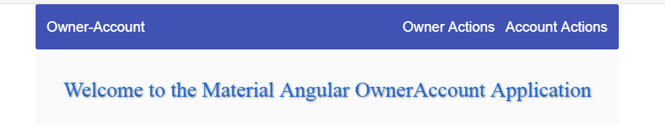
Now if we can have another look at our menu. It looks much nicer, isn’t it?
If we take a look at the icon button code, we can see the onToggleSidenav() event. We need to implement it inside the header.component.ts file:
import { Component, OnInit, Output, EventEmitter } from '@angular/core';

@Component({
  selector: 'app-header',
  templateUrl: './header.component.html',
  styleUrls: ['./header.component.css']
})
export class HeaderComponent implements OnInit {

  @Output() public sidenavToggle = new EventEmitter();

  constructor() { }

  ngOnInit() {
  }

  public onToggleSidenav = () => {
    this.sidenavToggle.emit();
  }

}
If you want to learn more about
@Output directives, you can read Angular Series Article About Decorators.
Finally, we have to react to this event emitter inside our app.component.html file:
<mat-sidenav-content>
  <app-header (sidenavToggle)="sidenav.toggle()"></app-header>
  <main>
    <router-outlet></router-outlet>
  </main>
</mat-sidenav-content>
Now it is obvious why we need the
#sidenav local reference inside the mat-sidenav component.
Our result should look like this:
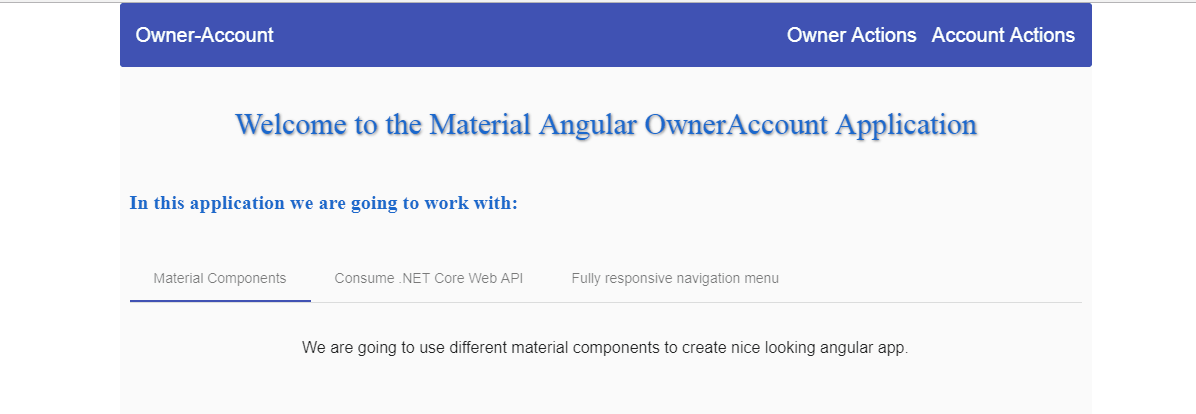
Excellent. The time has come to implement the side navigation.
Creating Side Navigation
To create side navigation items, we are going to use the mat-nav-list element that resides inside MatListModule. So, let’s register this module first in the material.module.ts file:
import { MatListModule } from '@angular/material/list';imports: [
MatListModule,
exports: [
    MatListModule,
Then let’s create the
sidenav-list component and modify the sidenav-list.component.html file:ng g component navigation/sidenav-list --skipTests
<mat-nav-list>
  <a mat-list-item routerLink="/home" (click)="onSidenavClose()">
      <mat-icon>home</mat-icon> <span class="nav-caption">Home</span>
  </a>
  <a mat-list-item routerLink="/owner" (click)="onSidenavClose()">
      <mat-icon>assignment_ind</mat-icon> <span class="nav-caption">Owner Actions</span>
  </a>
  <a mat-list-item routerLink="#" (click)="onSidenavClose()">
      <mat-icon>account_balance</mat-icon><span class="nav-caption">Account Actions</span>
  </a>
</mat-nav-list>
As you can see, we use the
mat-nav-list as a container with all the anchor tags containing the mat-list-item attributes. The click event is there for every link, to close the side-nav as soon as a user clicks on it. Finally, every link contains its own mat-icon.
Let’s continue by adding some styles to the sidenav-list.component.css file:
a{
    text-decoration: none;
    color: white;
}

a:hover, a:active{
    color: lightgray;
}

.nav-caption{
    display: inline-block;
    padding-left: 6px;
}
And finally, let’s modify the
sidenav-list.component.ts file:import { Component, OnInit, Output, EventEmitter } from '@angular/core';
@Component({
selector: 'app-sidenav-list',
templateUrl: './sidenav-list.component.html',
styleUrls: ['./sidenav-list.component.css']
})
export class SidenavListComponent implements OnInit {
@Output() sidenavClose = new EventEmitter();
constructor() { }
ngOnInit() {
}
public onSidenavClose = () => {
this.sidenavClose.emit();
}
}
That’s it. We can now open the
app.component.html file and modify it to add the side-nav component:<mat-sidenav #sidenav role="navigation"> <app-sidenav-list (sidenavClose)="sidenav.close()"></app-sidenav-list> </mat-sidenav>
In this code, we react to the event emitter from the sidenav-list component and close the side-nav by using the
#sidenav local reference.
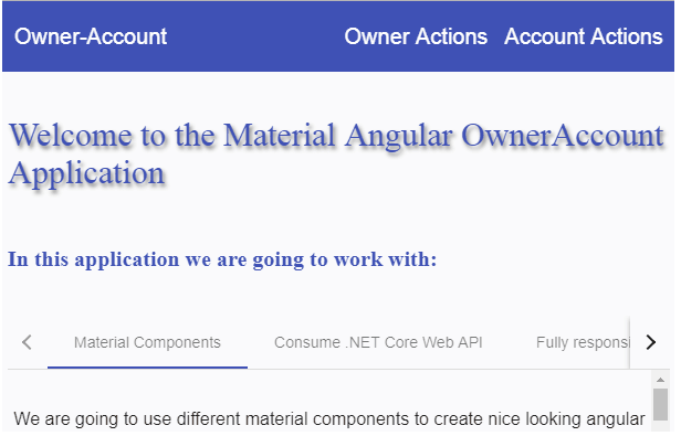
Now, all we have to do is to take a look at our result:
Multi-Menu in Side-Nav
There is one more thing we want to show you. For now, we only have a one clickable link per section, inside our sidenav. But what if we want to have a menu item and when we click that menu item other options appear? Well, we are going to show you how to do that as well.
So, in the sidenav-list.component.html file, we need to add the following code below the last anchor tag:
<mat-list-item [matMenuTriggerFor]="menu">
    <mat-icon>unfold_more</mat-icon>
    <a matline>Example</a>
</mat-list-item>
<mat-menu #menu="matMenu">
  <button mat-menu-item (click)="onSidenavClose()">View profile</button>
  <button mat-menu-item (click)="onSidenavClose()">Add contact</button>
</mat-menu>
For this to work, we need to register
MatMenuModule:import { MatMenuModule } from '@angular/material/menu';imports: [
MatMenuModule,
exports: [
    MatMenuModule,
As a result, we should have a multi-menu option in our side navigation bar:
Conclusion
Awesome.
Now we have our own responsive navigation menu, built from scratch.
In this article we have learned:
- How to create the Angular Material Navigation
- The way to create a side navigation material menu
- How to implement multi-menu options in the side navigation
In the next article, we are going to learn more about Material Table with Filter, Sort and Paging functionalities.