

Angular Input and Output decorators are very important while establishing a relationship between parent and child components in our applications.
While developing our project, sometimes our components may become large and hard to read. So, it is always a good choice to split that big component into a few smaller ones. Furthermore, smaller components can be reused into other components, therefore creating the parent-child relationship is a very good idea. The child component depends on the parent component, and because of that, they make one coherent part.
Creating child components by using Angular Input and Output decorators is going to be our goal in this post.
For the complete navigation and all the basic instructions of the Angular series, check out: Introduction of the Angular series.
Let’s start
Overview
In the situations where we want to send some content from a parent to a child component, we need to use the @Input decorator in a child component to provide a property binding between those components. Moreover, we can have some events in a child component that reflect its behavior back to a parent component. For that purpose, we are going to use @Output decorator with the EventEmitter.
To handle success messages and error messages (other than 500 or 404 messages), we are going to create a modal window child components. We are going to reuse them in every component that requires displaying these types of messages. When we want to register our reusable component it is a good practice to create a shared module and to register and export our components inside that module. Then, we can use those reusable components in any higher-level component we want by registering the shared module inside a module responsible for that higher-order component.
Split OwnerDetails with Angular Input and Output Decorators
Currently, we have our OwnerDetails component that shows both the owner and accounts data on the page. We can split that up thus making our component cleaner and easier to maintain.
To do that, let’s start with the creation of a new component:
ng g component owner/owner-details/owner-accounts --skip-tests
We place the files from this component inside the owner-details folder because we are only going to use it to extract some content from the OwnerDetails component.
Now, let’s modify the owner-accounts.component.ts file:
import { Component, Input, OnInit } from '@angular/core';

import { Account } from './../../../_interfaces/account.model';

@Component({
  selector: 'app-owner-accounts',
  templateUrl: './owner-accounts.component.html',
  styleUrls: ['./owner-accounts.component.css']
})
export class OwnerAccountsComponent implements OnInit {
  @Input() accounts: Account[];

  constructor() { }

  ngOnInit(): void {
  }

}
We add a single Account array property and decorate it with the @Input decorator.
Next, we are going to cut the table that shows accounts from the owner-details.component.html file and replace it with the selector from the OwnerAccountsComponent:
//previous code

<ng-template #advancedUser>
    <div class="row">
      <div class="col-md-3">
        <strong>Type of user:</strong>
      </div>
      <div class="col-md-3">
        <span class="text-info">Advanced user.</span>
      </div>
    </div>
  </ng-template>
</div>

<app-owner-accounts [accounts]="owner?.accounts"></app-owner-accounts>
Here, we use the app-owner-accounts selector to inject the child component into the parent component. Also, we use the property binding to pass all the accounts from the owner object to the @Input accounts property in the child component.
After that, we can paste the code we cut from the parent component inside the owner-details.component.html file:
<div class="row">
  <div class="col-md-12">
    <div class="table-responsive">
      <table class="table table-striped">
        <thead>
          <tr>
            <th>Account type</th>
            <th>Date created</th>
          </tr>
        </thead>
        <tbody>
          <tr *ngFor="let account of accounts">
            <td>{{account?.accountType}}</td>
            <td>{{account?.dateCreated | date: 'dd/MM/yyyy'}}</td>
          </tr>
        </tbody>
      </table>
    </div>
  </div>
</div>
We can also notice that we are not using the owner?.accounts anymore inside the *ngFor directive but just the accounts property.
With that in place, we can start our app and navigate to the OwnerDetails component, and we are going to see the same result as before. Just this time, we’ve split the logic into two components.
Emmit Events from Child Component Using @Output Decorator
Let’s use the simplest example to show how we can emit events from the child component to the parent component.
To start, we are going to add some modifications inside OwnerAccountsComponent:
import { Component, EventEmitter, Input, OnInit, Output } from '@angular/core';

import { Account } from './../../../_interfaces/account.model';

@Component({
  selector: 'app-owner-accounts',
  templateUrl: './owner-accounts.component.html',
  styleUrls: ['./owner-accounts.component.css']
})
export class OwnerAccountsComponent implements OnInit {
  @Input() accounts: Account[];
  @Output() onAccountClick: EventEmitter<Account> = new EventEmitter();

  constructor() { }

  ngOnInit(): void {
  }

  onAccountClicked = (account: Account) => {
    this.onAccountClick.emit(account);
  }

}
We use the @Ouput decorator with the EventEmitter to emit an event from a child to a parent component. Also, by providing a type for the EventEmitter, we state that it can emit only the Account data type. Furthermore, we create a new onAccountClicked function, where we accept an account and call the emit function to emit this event to the parent component.
To be able to call this onAccountClicked function, we have to modify the owner-accounts.component.html file:
<tbody>
  <tr *ngFor="let account of accounts" (click)="onAccountClicked(account)">
    <td>{{account?.accountType}}</td>
    <td>{{account?.dateCreated | date: 'dd/MM/yyyy'}}</td>
  </tr>
</tbody>
We just add the click event to the row inside the table.
Finally, in order to have a pointer cursor when we hover over our account rows, we are going to modify the owner-accounts.component.css file:
tbody tr:hover{
  cursor: pointer;
}
For our emitter to work, we have to subscribe to it from our parent component.
The first thing we are going to do is to add a single function inside the owner-details.component.ts file:
printToConsole= (param: Account) => {
  console.log('Account parameter from the child component', param)
}
And then, we are just going to connect the dots in the owner-details.component.html file:
<app-owner-accounts [accounts]="owner?.accounts"
  (onAccountClick)="printToConsole($event)"></app-owner-accounts>
Here, we create the event with the same name as our @Output property in the child component and assign a local printToConsole function to it. Also, we use $event as a parameter to accept the emitted object from the child component.
At this point, we can start our app, and once we navigate to the OwnerDetails component (by clicking the Details button), we can see that as soon as we click on any account, we are going to log a message in a console.
Creating the Shared Module
As we said, for the shared components, it is always a good practice to create a shared module. So, let’s start by creating that shared module in the shared folder:
ng g module shared --module owner
This command will also include the SharedModule inside the owner.module.ts file:
CREATE src/app/shared/shared.module.ts (192 bytes)
UPDATE src/app/owner/owner.module.ts (556 bytes)
Then let’s modify the shared.module.ts file:
import { NgModule } from '@angular/core';
import { CommonModule } from '@angular/common';

@NgModule({
  declarations: [],
  imports: [
    CommonModule
  ],
  exports: []
})
export class SharedModule { }
Error Modal Component
Let’s execute AngularCLI command to create an error modal component:
ng g component shared/modals/error-modal --skip-tests
Besides creating component files, this command is going to import a new component into the shared module. But we need to export it manually:
import { NgModule } from '@angular/core';
import { CommonModule } from '@angular/common';
import { ModalModule } from 'ngx-bootstrap/modal';

import { ErrorModalComponent } from './modals/error-modal/error-modal.component';

@NgModule({
  declarations: [
    ErrorModalComponent
  ],
  imports: [
    CommonModule,
    ModalModule.forRoot()
  ],
  exports: [
    ErrorModalComponent
  ]
})
export class SharedModule { }
In the exports array, we export our component. Additionally, since we are going to use the modal component from ngx-bootstrap, we inject it inside the imports array using the forRoot function.
Now, let’s modify the error-modal.component.ts file:
import { Component, OnInit } from '@angular/core';
import { BsModalRef } from 'ngx-bootstrap/modal';

@Component({
  selector: 'app-error-modal',
  templateUrl: './error-modal.component.html',
  styleUrls: ['./error-modal.component.css']
})
export class ErrorModalComponent implements OnInit {
  modalHeaderText: string;
  modalBodyText: string;
  okButtonText: string;

  constructor(public bsModalRef: BsModalRef) { }

  ngOnInit(): void {
  }

}
Here we have three properties that we are going to use in the HTML part of this component. Also, we inject the BsModalRef class inside the constructor. We will use it in the HTML file as well, thus making it public.
Let’s continue by modifying the error.modal.component.html file:
<div class="modal-header">
<h4 class="modal-title pull-left">{{modalHeaderText}}</h4>
<button type="button" class="btn-close close pull-right"
aria-label="Close" (click)="bsModalRef.hide()">
<span aria-hidden="true" class="visually-hidden">×</span>
</button>
</div>
<div class="modal-body">
{{modalBodyText}}
</div>
<div class="modal-footer">
<button type="button" class="btn btn-danger" (click)="bsModalRef.hide()">{{okButtonText}}</button>
</div>
Just a simple HTML file that uses string interpolation to add the text for the header, body, and button. Additionally, we can see how we use bsModalRef, which we injected inside the constructor, to call the hide function, to hide the modal.
Creating Success Modal Component
To continue let’s create a success modal in the same way as we did with the error modal:
ng g component shared/modals/success-modal --skip-tests
We have to export the success-modal component from the shared.module.ts file:
exports: [
  ErrorModalComponent,
  SuccessModalComponent
]
Then, let’s modify our success-modal.component.ts file:
import { BsModalRef } from 'ngx-bootstrap/modal';
import { Component, EventEmitter, OnInit } from '@angular/core';

@Component({
  selector: 'app-success-modal',
  templateUrl: './success-modal.component.html',
  styleUrls: ['./success-modal.component.css']
})
export class SuccessModalComponent implements OnInit {
  modalHeaderText: string;
  modalBodyText: string;
  okButtonText: string;
  redirectOnOk: EventEmitter<any> = new EventEmitter();

  constructor(private bsModalRef: BsModalRef) { }

  ngOnInit(): void {
  }

  onOkClicked = () => {
    this.redirectOnOk.emit();
    this.bsModalRef.hide();
  }

}
We are going to use the success component once we execute the create, update, or delete actions successfully, and by pressing the OK button we are going to redirect a user to the owner-list component. That’s why we use that EventEmitter class. Also, this time we use the private bsModalRef, because we use it only inside the .ts file.
Finally, let’s modify the success-modal.component.html file:
<div class="modal-header">
<h4 class="modal-title pull-left">{{modalHeaderText}}</h4>
<button type="button" class="btn-close close pull-right"
aria-label="Close" (click)="onOkClicked()">
<span aria-hidden="true" class="visually-hidden">×</span>
</button>
</div>
<div class="modal-body">
{{modalBodyText}}
</div>
<div class="modal-footer">
<button type="button" class="btn btn-success" (click)="onOkClicked()">{{okButtonText}}</button>
</div>
We are going to use both of these modal components in the next article.
Directives
In the last part of this article, we are going to show you how to use directives to add additional behavior to elements in our Angular application.
So, let’s create the Append directive in the shared folder:
ng g directive shared/directives/append --skip-tests
This will create a new file with the @Directive decorator and the [appAppend] selector. We are going to use that selector to add the additional behavior to elements inside the OwnerDetails component:
<div class="row" *ngIf='owner?.accounts.length <= 2; else advancedUser'>
  <div class="col-md-3">
    <strong>Type of user:</strong>
  </div>
  <div class="col-md-3">
    <span [appAppend]="owner" class="text-success">Beginner user.</span>
  </div>
</div>
<ng-template #advancedUser>
  <div class="row">
    <div class="col-md-3">
      <strong>Type of user:</strong>
    </div>
    <div class="col-md-3">
      <span [appAppend]="owner" class="text-info">Advanced user.</span>
    </div>
  </div>
</ng-template>
As you can see, we add the [appAppend] selector inside both span elements and also, we pass the owner object as a parameter to our directive.
Now, we have to modify the directive file:
import { Directive, ElementRef, Input, OnChanges, Renderer2, SimpleChanges } from '@angular/core';
import { Owner } from '../../_interfaces/owner.model';

@Directive({
  selector: '[appAppend]'
})
export class AppendDirective implements OnChanges {
  @Input('appAppend') ownerParam: Owner;

  constructor(private element: ElementRef, private renderer: Renderer2) { }

  ngOnChanges(changes: SimpleChanges) {
    if(changes.ownerParam.currentValue){
      const accNum = changes.ownerParam.currentValue.accounts.length;
      const span = this.renderer.createElement('span');
      const text = this.renderer.createText(` (${accNum}) accounts`);

      this.renderer.appendChild(span, text);
      this.renderer.appendChild(this.element.nativeElement, span);
    }
  }
}
Here we have the ownerParam property that we decorate with the @Input decorator. We do this in order to accept the parameter from the parent component. Then, inside the constructor, we inject ElementRef and Renderer2 classes. We use the ElementRef class to reference an element we applied our directive to. Additionally, we use Renderer2 to manipulate elements without touching the DOM directly. So, as you can see, no need for JQuery to manipulate the DOM elements – Agular provides us with all the tools we need.
After the constructor modification, we add a new ngOnChanges lifecycle method. This method is called before the ngOnInit lifecycle hook, and also every time one or more input properties change. Inside it, we check if our input property has the currentValue populated. If it does, we extract the number of accounts, use renderer to create new span, and text elements, and combine them together.
Finally, we use the same renderer property to combine our nativeElement with the newly created span element.
Now we can start our apps, and once we navigate to the details page of any user, we will see our directive in action:
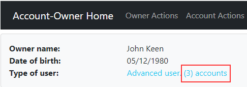
We see that we have new information next to the user’s description. For different users, we will get different account numbers.
Conclusion
There we go. In this article, we’ve learned what is the purpose of Angular Input-Output decorators and how to share information between parent and child components. Also, we’ve talked about the shared module and using directives to add additional behavior to the elements of the Angular app.
In the next part of the series, we are going to start with the creation of the owner and form validation.

The directive works but is necessary to manually add it to exports in shared.module.ts:
exports: [
ErrorModalComponent,
SuccessModalComponent,
AppendDirective
]
Hi Michael. Have you tried without it? I think this is the best way to get an answer to your question 🙂
Thanks Michael! That’s fixed my issue also, without adding it the directive will not show
@Marinko Thanks for the great article!
But is the guide above still showing public bsModalRef…?
constructor(public bsModalRef: BsModalRef) { }Best regards.
Thank you. You are correct. The source code is good, I’ve just forgot to modify that in the snippet. It should be private because we use it only inside the component file.
Hi Marinko, I follow your code only with diffret data and I have error when I add directive in export array of shared module acordin your instruction. Do you have any advice for a solution?
Hello Darko. I really can’t say why do you have that error. To be honest, I am not sure what is the error at all. The error message doesn’t say much. I am not sure if this is due to different Angular versions since our project is written in Angular 9. Have you maybe tried to compare our solution with yours?
Hello mr Spasojevic, I have been following your tutorials for consuming a webapi with Angular and they helped me very much. Now I am building the front-end but I am facing problem with the successModal in this particular part of the tutorial. When I hit save to create an owner, I get the following error in Console. It is attached to this comment: ERROR TypeError: jquery__WEBPACK_IMPORTED_MODULE_0__(…).modal is not a function. The modal does not show up and I am not redirected to the list page.
I have installed the dependencies as you have specified in the beginning of the tutorial for building the application with Angular and I do not understand what is missing.
In angular.json I have the following:
and in tsconfig.app.json I have:
 "compilerOptions": {
    "outDir": "../out-tsc/app",
    "types": ["jquery", "bootstrap"]
  },
What am I missing?
Well, from the error it is obvious that your Angular app doesn’t recognize the modal function as a function from JQuery. To be honest, I am not sure what is the problem there but that’s why we provide our source code. Please download it and compare our solution to yours. This is the easiest way to find your issue.
Hi Marinko,
Trying to build project after chapter 12, got this message:
ERROR in src/app/shared/directives/datepicker.directive.ts(12,38): error TS2339: Property ‘datepicker’ does not exist on type ‘JQuery’.
I checked and reinstalled jQuery libraries as at you in the first part, did not help.
Thanx
Hello Vasily. Please verify that you have imported types in the tsconfig.app.json file and not just tsconfig.json file. Your error sounds like that your Angular app doesn’t know about JQuery types at all.
here it is, I found it in the root, but in your source it is in src folder
{
“extends”: “./tsconfig.json”,
“compilerOptions”: {
“outDir”: “./out-tsc/app”,
“types”: [
“jquery”,
“bootstrap”,
“jquery”
]
},
“include”: [
“src/**/*.ts”
],
“exclude”: [
“src/test.ts”,
“src/**/*.spec.ts”
]
}
and tsconfig.json:
{
“compileOnSave”: false,
“compilerOptions”: {
“baseUrl”: “./”,
“outDir”: “./dist/out-tsc”,
“sourceMap”: true,
“declaration”: false,
“downlevelIteration”: true,
“experimentalDecorators”: true,
“module”: “esnext”,
“moduleResolution”: “node”,
“importHelpers”: true,
“target”: “es2015”,
“typeRoots”: [
“node_modules/@types”
],
“lib”: [
“es2018”,
“dom”
]
}
}
Well in root you have tsconfig.json file and in src folder you have tsconfig.app.json. I really don’t know how it ended up in root folder. But the most important part is that you solved it. Or have you ?
Thanx for help
The problem was in tsconfig.app.json in types
insted of jquery and jqueryui was jquery and jquery
Hi Marinko,
I have created the datepicker.directive.ts as per blog. But when i am trying to run app. I am getting below error.
src/app/shared/directives/datepicker.directive.ts(12,5): error TS2304: Cannot find name ‘$’.
How can I solve it.
Thanks
Omkar.
Have you installed jqueryUi and typings for it? As we have explained in the first part of Angular series.
Yes I have followed all the steps mentioned in all article.
Well, the $ sign is a helper (you will read syntactic sugar) for the jQuery and jQueryUI libraries. With it you can call all the functions and properties from those mentioned libraries. You can check that by typing $ anywhere in your directive, you MUST see the intellisense with all the methods and properties. If you don’t see that, than you didn’t install all the stuff it needs. So, when I read your error, it seems to me that either you didn’t install jQueryUI or its typings or you didn’t place the reference to jQueryUI library in th angular.json file or its typings in the tsconfig.app.json file. If you can’t find the error, please upload your code and I will review it.
All the best.