

In this article, we are going to create the error pages and the details component. The main focus will be on the material components.
We are going to create the Not-Found component, the Server-Error component, and finally the Owner-Details component. Through these components, we will learn how to use different Angular Material components in our project.
For the complete navigation and all the basic instructions of the Angular Material series, check out: Introduction of the Angular Material series.
The source code is available at GitHub Angular Material Error and Details Pages – Source Code
We strongly recommend reading our Angular Series prior to reading this article, if you want to restore your knowledge about that topic or to learn Angular development overall.
So, let’s start.
We are going to divide this post into several sections:
- Not-Found Component and Material Progress Bar
- Server-Error Component With Spinner and CheckBox Material Components
- Error Handling Service
- Details Page – Card Select and Expansion Panel Components
Not-Found Component and Material Progress Bar
The first thing we need to do is to create a new not-found component:
ng g component error-pages/not-found --skipTests
After that, we are going to change the routes in the main routing module:
import { NotFoundComponent } from '../error-pages/not-found/not-found.component';const routes: Routes = [
{ path: 'home', component: HomeComponent},
{ path: 'owner', loadChildren: "./../owner/owner.module#OwnerModule" },
{ path: '404', component: NotFoundComponent},
{ path: '', redirectTo: '/home', pathMatch: 'full' },
{ path: '**', redirectTo: '/404', pathMatch: 'full'}
];
Now, if we try to load some non-existing address, we will get the NotFound component instead, with the “not-found works”.
Of course, we don’t want this message, so we are going to modify the not-found.component.html file:
<section fxLayout="column wrap" fxLayoutGap="60px" fxLayoutAlign="center center">
  <div fxFlex>
    404 We are searching for your page...
  </div>
  <div fxFlex>
    <mat-progress-bar mode="indeterminate"></mat-progress-bar>
  </div>
  <div fxFlex>
    ... But we can not find it.
  </div>
</section>
As we can see, we are using the mat-progress-bar material component, and for that reason, we need to import the required module into the material.module.ts file:
import { MatProgressBarModule } from '@angular/material/progress-bar';imports: [
MatProgressBarModule,
exports: [
    MatProgressBarModule,
Finally, let’s add some styles to the not-found.component.css file:
section div:nth-child(1), section div:nth-child(3){
    color: blue;
    font-size: 50px;
}

section div:nth-child(1){
    margin-top: 20px;
}

section div:nth-child(2){
    width: 50%;
}
That is it. We can inspect our result by typing a none-existing URL (localhost:4200/something):
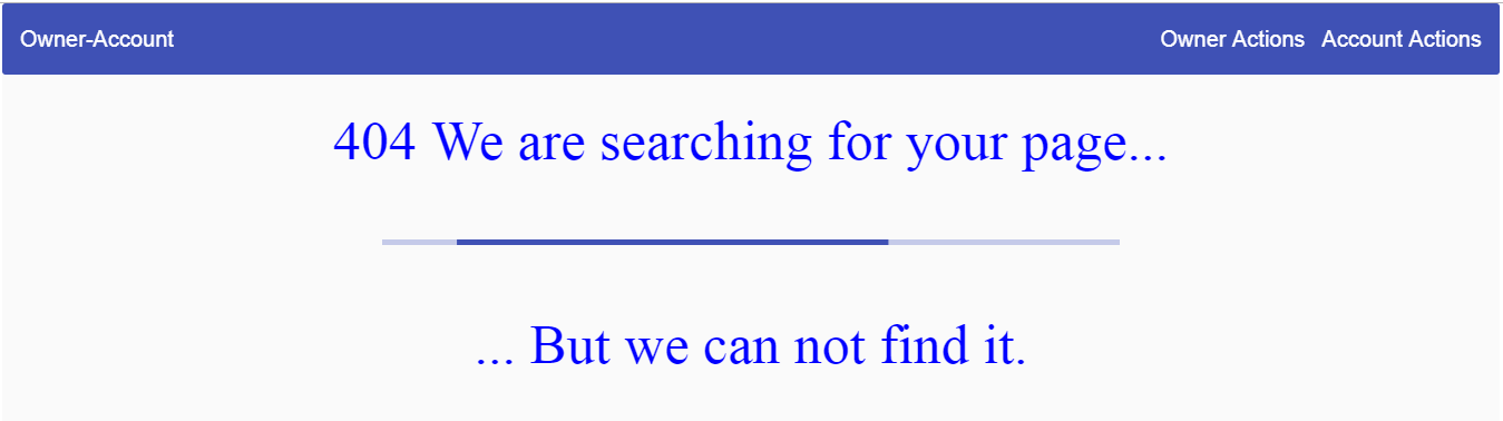
This looks good.
Let’s continue with the Server-Error component.
Server-Error Component With Spinner and CheckBox Material Components
We are going to start with Server-Error component creation:
ng g component error-pages/server-error --skipTests
Having that done, let’s modify the routing file:
import { ServerErrorComponent } from '../error-pages/server-error/server-error.component';const ownerRoutes: Routes = [
{ path: 'home', component: HomeComponent },
{ path: 'owner', loadChildren: "./../owner/owner.module#OwnerModule" },
{ path: '404', component: NotFoundComponent },
{ path: '500', component: ServerErrorComponent },
{ path: '', redirectTo: '/home', pathMatch: 'full' },
{ path: '**', redirectTo: '/404', pathMatch: 'full' }
];
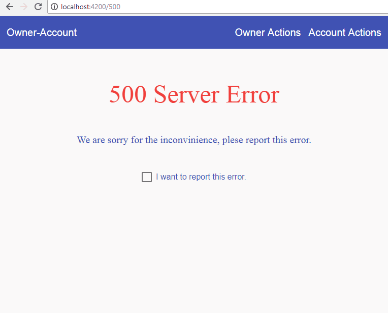
For the visual experience, we need to modify the server-error.component.html file:
<section fxLayout="column wrap" fxLayoutAlign="center center" fxLayoutGap="30px">
  <div fxFlex>
    <p>500 Server Error</p>
    <p>We are sorry for the inconvinience, plese report this error.</p>
  </div>
  <div fxFlex>
    <mat-checkbox (change)="checkChanged($event)" color="primary">I want to report this error.</mat-checkbox>
  </div>
  <div fxFlex *ngIf="reportedError">
      <mat-progress-spinner mode="determinate" [value]="errorPercentage"></mat-progress-spinner>
      <h1>{{errorPercentage}}%</h1>
  </div>
</section>
Because we are using the checkbox and progress-spinner components, we need to import their modules into the material.module.ts file:
import {MatCheckboxModule } from '@angular/material/sheckbox';
import { MatProgressSpinnerModule } from '@angular/material/progress-spinner'
imports: [
    MatProgressSpinnerModule,
    MatCheckboxModule,
exports: [
    MatProgressSpinnerModule,
    MatCheckboxModule,
Ok, we have imported all the necessary modules and now we are going to modify the server-error.component.ts file:
import { Component, OnInit } from '@angular/core';

@Component({
  selector: 'app-server-error',
  templateUrl: './server-error.component.html',
  styleUrls: ['./server-error.component.css']
})
export class ServerErrorComponent implements OnInit {
  public reportedError: boolean;
  public errorPercentage: number = 0;
  public timer;

  constructor() { }

  ngOnInit() {
  }

  public checkChanged = (event) => {
    this.reportedError = event.checked;

    this.reportedError ? this.startTimer() : this.stopTimer();
  }

  private startTimer = () => {
    this.timer = setInterval(() => {
      this.errorPercentage += 1;

      if (this.errorPercentage === 100) {
        clearInterval(this.timer);
      }
    }, 30);
  }

  private stopTimer = () => {
    clearInterval(this.timer);
    this.errorPercentage = 0;
  }

}
And finally, let’s modify the server-error.component.css file:
section div p:nth-child(1){
    font-size: 50px;
    text-align: center;
    color: #f44336;
}

section div p:nth-child(2){
    font-size: 20px;
    text-align: center;
    color: #3f51b5;
}

mat-checkbox {
    color: #3f51b5;
}

section div h1{
    text-align: center;
    color: #3f51b5;
    position: relative;
    top: -85px;
}
Our result should look like this:
Error Handling Service
It is not enough just to have the error pages, we need to handle errors and to redirect the user to the required page. For that, we are going to create an error-handler service.
We are just going to write our code, without any explanation because this is all angular specific. We have a great article .NET Core 2.0, Angular and Mysql. Error Handling in which we have explained everything related to the topic. Additionally, you can use H
So, let’s create a service and modify it:
ng g service shared/error-handler --skipTests
import { Injectable } from '@angular/core';
import { HttpErrorResponse } from '@angular/common/http';
import { Router } from '@angular/router';

@Injectable({
  providedIn: 'root'
})
export class ErrorHandlerService {
  public errorMessage: string = '';

  constructor(private router: Router) { }

  public handleError = (error: HttpErrorResponse) => {
    if(error.status === 500){
      this.handle500Error(error);
    }
    else if(error.status === 404){
      this.handle404Error(error)
    }
    else{
      this.handleOtherError(error);
    }
  }

  private handle500Error = (error: HttpErrorResponse) => {
    this.createErrorMessage(error);
    this.router.navigate(['/500']);
  }

  private handle404Error = (error: HttpErrorResponse) => {
    this.createErrorMessage(error);
    this.router.navigate(['/404']);
  }

  private handleOtherError = (error: HttpErrorResponse) => {
    this.createErrorMessage(error);
    //TODO: this will be fixed later;
  }

  private createErrorMessage(error: HttpErrorResponse){
    this.errorMessage = error.error ? error.error : error.statusText;
  }
}
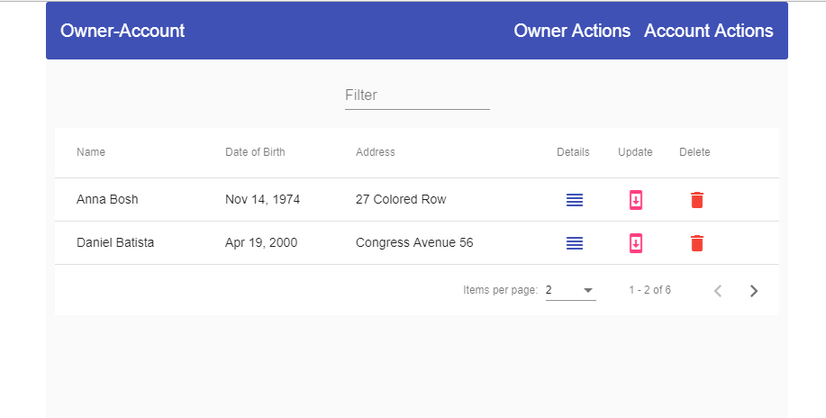
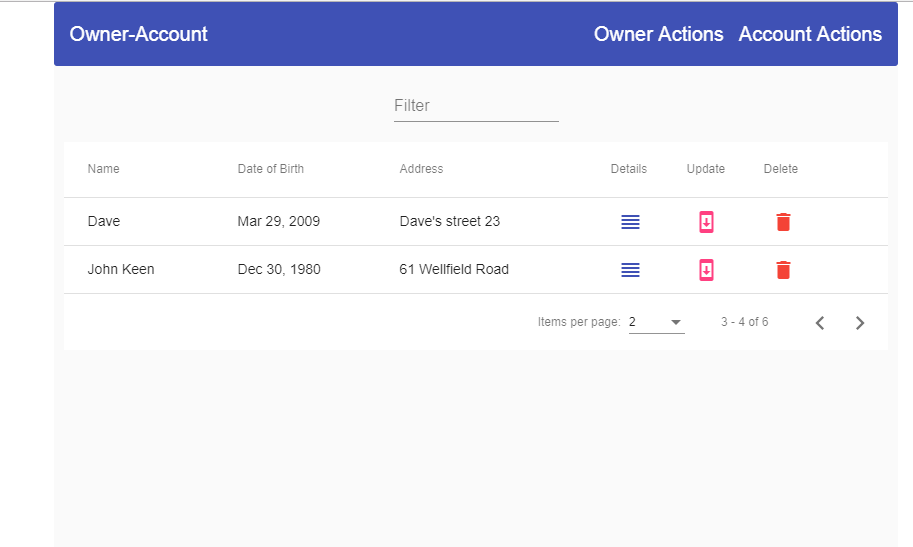
For now, this service can be implemented only in the owner-list component, so let’s do that:
import { ErrorHandlerService } from '../../shared/error-handler.service';
...
constructor(private repoService: RepositoryService, private errorService: ErrorHandlerService) { }
...
public getAllOwners = () => {
    this.repoService.getData('api/owner')
    .subscribe(res => {
      this.dataSource.data = res as Owner[];
    },
    (error) => {
      this.errorService.handleError(error);
    })
  }
That is it. Now if our server returns the not found response we will redirect a user to the not found page. The same will happen for the internal server error, just another page.
Of course, if you want, you can implement the Http Interceptor to intercept the request and throw an error, but the principle is the same.
Details Page – Card, Select and Expansion Panel Components
In this section, we are going to create details functionality for our application. To do that, let’s first create the owner-details component:
ng g component owner/owner-details --skipTests
Then, let’s configure the routes for this new component the owner-routing.module.ts file:
import { OwnerDetailsComponent } from '../owner-details/owner-details.component';

const routes: Routes = [
  { path: 'owners', component: OwnerListComponent },
  { path: 'details/:id', component: OwnerDetailsComponent}
];
After that, let’s modify the owner-list.component.ts file:
import { Router } from '@angular/router';constructor(private repoService: RepositoryService, private errorService: ErrorHandlerService, private router: Router) { }public redirectToDetails = (id: string) => {
let url: string = `/owner/details/${id}`;
this.router.navigate([url]);
}
Right now, we can navigate to our details page by clicking on the Details button on the owner-list component. The next thing we are going to do is to add an additional interface and change our existing one:
export interface Account{
    id: string;
    dateCreated: Date;
    accountType: string;
    ownerId?: string;
}
import { Account } from './account.model';
export interface Owner{
    id: string;
    name: string;
    dateOfBirth: Date;
    address: string;

    accounts?: Account[];
}
After all of these changes, we need to modify the owner-details component, to show our details data on the page.
So, let’s start with the owner-details.component.ts file:
import { Component, OnInit } from '@angular/core';
import { Owner } from './../../_interface/owner.model';
import { Router, ActivatedRoute } from '@angular/router';
import { RepositoryService } from './../../shared/repository.service';
import { ErrorHandlerService } from './../../shared/error-handler.service';

@Component({
  selector: 'app-owner-details',
  templateUrl: './owner-details.component.html',
  styleUrls: ['./owner-details.component.css']
})
export class OwnerDetailsComponent implements OnInit {
  public owner: Owner;
  public showAccounts;

  constructor(private repository: RepositoryService, private router: Router,
    private activeRoute: ActivatedRoute, private errorHandler: ErrorHandlerService) { }

  ngOnInit() {
    this.getOwnerDetails();
  }

  private getOwnerDetails = () =>{
    let id: string = this.activeRoute.snapshot.params['id'];
    let apiUrl: string = `api/owner/${id}/account`;

    this.repository.getData(apiUrl)
    .subscribe(res => {
      this.owner = res as Owner;
    },
    (error) =>{
      this.errorHandler.handleError(error);
    })
  }
}
Excellent.
We have prepared the logic to fetch the data from the server, so the obvious continuation is to show that data on the HTML page.
Because we are going to have a lot of code for this component, we are going to create two additional components to spread our HTML code between them.
That being said, let’s create those components:
ng g component owner/owner-details/owner-data --skipTests
ng g component owner/owner-details/account-data --skipTests
Owner-Data Component
We are going to modify the owner-data component first.
The HTML part:
<section fxLayout="row wrap" fxLayoutAlign="center center">
    <mat-card fxFlex="500px" fxFlex.xs="100%">
        <mat-card-title>Details for the clicked owner</mat-card-title>
        <mat-card-content>
          <div fxLayout="column wrap" fxLayoutGap="40px">
            <div fxLayout="row wrap" fxFlex>
              <div fxFlex><strong>Owner's name:</strong></div>
              <div fxFlex>{{owner?.name}}</div>
            </div>

            <div fxLayout="row wrap" fxFlex>
              <div fxFlex><strong>Date of birth:</strong></div>
              <div fxFlex>{{owner?.dateOfBirth | date}}</div>
            </div>

            <div fxLayout="row wrap" fxFlex *ngIf='owner?.accounts.length <= 2; else advancedUser'>
              <div fxFlex><strong>Type of user:</strong></div>
              <div fxFlex class="beginner-color">Beginner user.</div>
            </div>
            <ng-template #advancedUser>
              <div fxLayout="row wrap" fxFlex>
                <div fxFlex><strong>Type of user:</strong></div>
                <div fxFlex class="advanced-color">Advanced user</div>
              </div>
            </ng-template>
          </div>
        </mat-card-content>
        <mat-card-actions>
          <mat-form-field>
            <mat-select placeholder="Show accounts" (selectionChange)="onChange($event)">
              <mat-option *ngFor="let opt of selectOptions" [value]="opt.value">
                {{opt.name}}
              </mat-option>
            </mat-select>
          </mat-form-field>
        </mat-card-actions>
      </mat-card>
</section>
Because we are using the mat-card component and the mat-select component, we need to import modules inside the material.module.ts file:
import { MatCardModule } from '@angular/material/card';
import { MatSelectModule } from '@angular/material/select';
imports: [
MatSelectModule,
MatCardModule,
exports: [
    MatSelectModule,
    MatCardModule,
Next thing we need to do is to modify the owner-data.component.ts file:
import { Owner } from './../../../_interface/owner.model';
import { Component, OnInit, Input, Output, EventEmitter } from '@angular/core';

@Component({
  selector: 'app-owner-data',
  templateUrl: './owner-data.component.html',
  styleUrls: ['./owner-data.component.css']
})
export class OwnerDataComponent implements OnInit {
  @Input() public owner: Owner;
  public selectOptions = [{name:'Show', value: 'show'}, {name: `Don't Show`, value: ''}];
  @Output() selectEmitt = new EventEmitter();

  constructor() { }

  ngOnInit() {
  }

  public onChange = (event) => {
    this.selectEmitt.emit(event.value);
  }

}
And finally, let’s modify the CSS file:
mat-card-content, mat-card-title, mat-card-actions {
    text-align: center;
}

mat-card-content{
    padding-top: 20px;
    padding-bottom: 20px;
}

.advanced-color{
    color: #3f51b5;
}

.beginner-color{
    color: #f44336;
}
In order to show our data, we need to include our components inside the owner-details component and check the current progress:
<app-owner-data [owner]='owner' (selectEmitt)='showAccounts = $event'></app-owner-data>
<app-account-data *ngIf='showAccounts'></app-account-data>
Account-Data Component
Let’s modify the HTML part of this component first:
<section fxLayout="row wrap" fxLayoutAlign="center center">
<mat-accordion fxFlex="500px" fxFlex.xs="100%">
<mat-expansion-panel *ngFor="let account of accounts; let i = index">
<mat-expansion-panel-header>
<mat-panel-title>
{{i+1}}. Account
</mat-panel-title>
<mat-panel-description>
Account Information
</mat-panel-description>
</mat-expansion-panel-header>
<div fxLayout="row wrap" fxLayoutAlign="center center">
<div fxFlex="35%" class="text-color"><strong>type:</strong> {{account?.accountType}}</div>
<div fxFlex class="text-color"><strong>created:</strong> {{account?.dateCreated | date}}</div>
</div>
</mat-expansion-panel>
</mat-accordion>
</section>
Then, let’s import the module for the accordion:
import { MatExpansionModule } from '@angular/material/expansion';imports: [
MatExpansionModule,
exports: [
    MatExpansionModule,
After that, we need to modify the account-data.component.ts file:
import { Component, OnInit, Input } from '@angular/core';

@Component({
  selector: 'app-account-data',
  templateUrl: './account-data.component.html',
  styleUrls: ['./account-data.component.css']
})
export class AccountDataComponent implements OnInit {
  @Input() public accounts: Account[];

  constructor() { }

  ngOnInit() {
  }

}
And, to modify the CSS file:
.text-color {
    color: #3f51b5;
}

mat-accordion{
    margin-top: 20px;
}
Excellent.
All we have left to do is to modify our owner-details.component.html file:
<app-owner-data [owner]='owner' (selectEmitt)='showAccounts = $event'></app-owner-data>
<app-account-data *ngIf='showAccounts' [accounts]='owner?.accounts'></app-account-data>
Our completed page should look like this:
Conclusion
And there you go. We have created additional pages in our project and made them functional and prettier by using Angular Material Components.
So, to summarize, we have learned:
- How to use Material Progress Bar and Spinner components
- The way to use CheckBox, Select and Card components
- To show additional data by using the Expansion-Panel component
In the next article, we are going to show you how to use Material Input components and to validate forms as well.

Hi Marinko,
I’m having trouble with this one, probably because my model is slightly different. One issue I have come across that I’m pretty sure is a code error is your Owner model in _interfaces. It has an optional variable (‘accounts’) of type ‘Account’. I am sure it should be of type ‘Account []’ (as it was in the non-material angular tutorial), otherwise the .length call (for basic / advanced users) doesn’t compile.
It doesn’t fix my issue either way, but if you could confirm my thoughts are correct it would remove a red herring avenue. Many thanks
Hi Mc Alex. You are completely right. This parameter shoud be an array. Obviousely I missed it and in Angular 9 compiler didn’t complain and everything still works, just tested. But if you are using a newer version of Angular, which you do for sure, compiler must have been upgraded to report this error – using .length on non-array property. It will be fixed. Thanks.
Yes I’m on Angular 11. It didn’t show as an error in Visual Studio, just VS Code. When (if) I fix my actual problem, I’ll check whether the declaration needs to indicate the collection or if current syntax works.
where do i get this source code? can you please mail me to [email protected]
Hello Rathnakar. Plesa read this and all our articles from the start. You’ll find the source code link in every article, that means even this one.
Hey Marinko,
What I need to use if when I click on Show/Show Account data, it’s show a data form to me?
Also, where is backend code for this part?
Hello Kyle. If you want the form to appear as soon as you expand the accordion, than you need to create that form inside the mat-expansion-panel tags. Just add it under the panel-header part. About the source code, it is our project from ASP.NET Core series. I mentioned this in the Mat Table article. Best regards.
Help me, Uncaught Error: Template parse errors:
‘mat-progress-bar’ is not a known element:
1. If ‘mat-progress-bar’ is an Angular component, then verify that it is part of this module.
Hello Leonardo. It seams that you haven’t included MatProgressBarModule inside the imports and exports array inside the Material module file. At least, the error states that.
i put this MatProgressBarModule in material.module.ts, but still problem.
i’m doind with angular 7
If you can’t solve it on your own, send us the code and we will look at it. Other than that, I can only read what error states.