

In the previous article, we’ve integrated MudBlazor into our Blazor WebAssembly application and started working with some material components and theme modification. But our navigation menu doesn’t look great. Well, to be honest, we didn’t do anything with it. That said, in this article, we are going to create a new Blazor material navigation menu, and improve our visual experience a lot. For that, we are going to use different MudBlazor components like AppBar, Drawer, Icons, NavMenu, Links, etc.
If you want to learn more about Blazor WebAssembly, we strongly suggest visiting our Blazor WebAssembly series of articles, where you can read about Blazor WebAssembly development, authentication, authorization, JSInterop, and other topics as well.
Let’s dive in.

Adding a Top Bar for Our Blazor Material Navigation Menu
Before we start with the coding part, we have to remove an existing css from our application. So, let’s navigate to wwwroot/css folder, open the app.css file and remove all the code inside.
Now, we can continue.
First, we are going to create a new layout in the HTML part of the MainLayout.razor file:
@inherits LayoutComponentBase

<MudLayout>
    <MudMainContent Class="pt-16 px-16">
        <MudContainer Class="mt-6">
            @Body
        </MudContainer>
    </MudMainContent>
</MudLayout>

<MudThemeProvider Theme="_currentTheme" />
As you can see, instead of the old code, we now have our new layout using the MudLayout component. Inside it, we specify the content part with the MudMainContent component and add some top (pt) and left/right (px) padding. Lastly, inside the MudContainer component, we render our content with the @Body property.
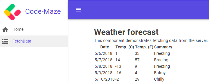
Now, if we start our app, it should be up and running but without our top and sidebar menus.
Adding Top Nav Bar to the Application
To add the top navigation bar, we have to use the MudAppBar component. So, let’s add it inside the MudLayout component:
<MudLayout>
    <MudAppBar Elevation="3">
        <MudIconButton Icon="@Icons.Material.Filled.Menu" Color="Color.Inherit" Edge="Edge.Start" />
        <MudAppBarSpacer />
        @if (_isLightMode)
        {
            <MudIconButton Icon="@Icons.Material.Filled.Brightness4" Color="Color.Inherit" OnClick="ToggleTheme" />
        }
        else
        {
            <MudIconButton Icon="@Icons.Material.Filled.Brightness5" Color="Color.Inherit" OnClick="ToggleTheme" />
        }
    </MudAppBar>
    <MudMainContent Class="pt-16 px-16">
        <MudContainer Class="mt-6">
            @Body
        </MudContainer>
    </MudMainContent>
</MudLayout>
Here, we use the mentioned MudAppBar component with an Elevation of three. Then, we add a single icon button, which we are going to use to open and close the sidebar. Right now it does nothing but soon enough, we will fix that. After that, we can see the MudAppBarSpaces component. This component implements a flex-grow css property pushing the next items in the app bar all the way to the right. Lastly, we have our icons for switching between light and dark themes. You can see an additional Color property, which we didn’t have in our previous article, for each icon.
We have to do one additional thing for the top bar. Right now, if we switch to a dark theme, our app bar stays the same. You can start the app and check that for yourself. But, we want to make it dark as well, so, let’s add two more properties to the Pallete object:
private MudTheme GenerateDarkTheme() =>
    new MudTheme
    {
        Palette = new Palette()
        {
            Black = "#27272f",
            Background = "#32333d",
            BackgroundGrey = "#27272f",
            Surface = "#373740",
            TextPrimary = "#ffffffb3",
            TextSecondary = "rgba(255,255,255, 0.50)",
            AppbarBackground = "#27272f",
            AppbarText = "#ffffffb3"
        }
    };
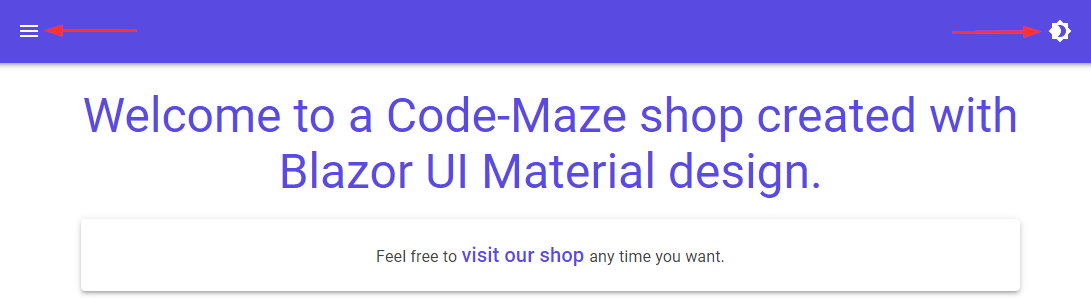
Now, if we start our app, we are going to see that our app bar looks good:
And as soon as we switch to a dark theme:
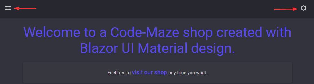
We can see that the color is dark now, and also, our icons change their color.
Adding Sidebar to the Blazor Material Navigation Menu
Before we add our sidebar, let’s add one more image to the assets folder:
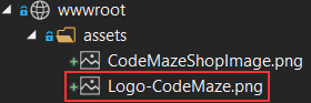
We are going to use this picture as a header in our sidebar.
Now, we can start working on a sidebar by adding a new component between the MudAppBar and MudMainContent component:
<MudLayout>
    <MudAppBar Elevation="3">
        <MudIconButton Icon="@Icons.Material.Filled.Menu" Color="Color.Inherit" Edge="Edge.Start" OnClick="ToggleSidebar" />
        <MudAppBarSpacer />
        @if (_isLightMode)
        {
            <MudIconButton Icon="@Icons.Material.Filled.Brightness4" Color="Color.Inherit" OnClick="ToggleTheme" />
        }
        else
        {
            <MudIconButton Icon="@Icons.Material.Filled.Brightness5" Color="Color.Inherit" OnClick="ToggleTheme" />
        }
    </MudAppBar>
    <MudDrawer @bind-Open="_sidebarOpen" Elevation="1">
        <MudDrawerHeader>
            <MudAvatar Color="Color.Transparent" Size="Size.Large" Image="assets/Logo-CodeMaze.png" />
            <MudText Typo="Typo.h5" Color="Color.Primary" Style="margin-top:10px; margin-left:15px;">Code-Maze</MudText>
        </MudDrawerHeader>
    </MudDrawer>
    <MudMainContent Class="pt-16 px-16">
        <MudContainer Class="mt-6">
            @Body
        </MudContainer>
    </MudMainContent>
</MudLayout>
We first add the OnClick event to the icon button because we want to click this icon and open/close our sidebar. Then, we can see the MudDrawer component. This component enables us to create the sidebar that will host our menu items. Also, we can see the @bind-Open two-way binding, which we bind with the _sidebarOpen variable. Inside the MudDrawer component, we use the MudDrawerHeader component to specify our sidebar’s header part. In the header, we show our logo using the MudAvatar component. In this case, we have to use a transparent color because otherwise, our logo will have some grayish background, which is something we don’t want. Next to the logo, we add a header text with Primary color and some styles:
Excellent.
Adding Items to the Sidebar
Now we can add our items by modifying the MudDrawer component:
<MudDrawer @bind-Open="_sidebarOpen" Elevation="1">
    <MudDrawerHeader>
        <MudAvatar Color="Color.Transparent" Size="Size.Large" Image="assets/Logo-CodeMaze.png" />
        <MudText Typo="Typo.h5" Color="Color.Primary" Style="margin-top:10px; margin-left:15px;">Code-Maze</MudText>
    </MudDrawerHeader>
    <MudNavMenu>
        <MudNavLink Href="/" Match="NavLinkMatch.All" Icon="@Icons.Filled.Home">Home</MudNavLink>
        <MudNavLink Href="/fetchdata" Icon="@Icons.Filled.Storage">FetchData</MudNavLink>
    </MudNavMenu>
</MudDrawer>
We are using the MudNavMenu component to specify that we want to add our menu items. Foreach menu item, we use the MudNavLink component, providing the Href property and the Icon property. We also add the Match attribute for the Home link because we don’t want it to be marked when we click on the FetchData link.
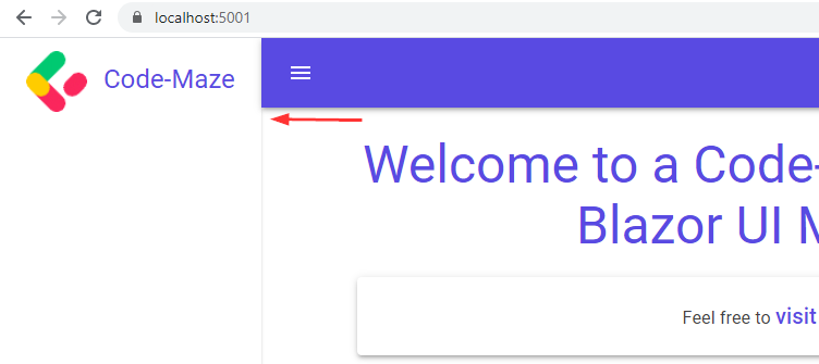
Let’s inspect our result now:
As we can see, it works like a charm.
Additionally, if we want a group of items in our sidebar, we can do that as well:
<MudNavMenu>
    <MudNavLink Href="/" Match="NavLinkMatch.All" Icon="@Icons.Filled.Home">Home</MudNavLink>
    <MudNavLink Href="/fetchdata" Icon="@Icons.Filled.Storage">FetchData</MudNavLink>
    <MudNavGroup Title="Expanding" Icon="@Icons.Filled.DashboardCustomize" Expanded="true">
        <MudNavLink Href="#" Icon="@Icons.Filled.Camera">Photos</MudNavLink>
        <MudNavLink Href="#" Icon="@Icons.Filled.Celebration">Party</MudNavLink>
    </MudNavGroup>
</MudNavMenu>
With the MudnavGroup component, we specify that we want to group our items. We also add populate the title, add an icon, and set our group to expand by default. Then, we just add our links:
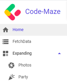
Looks great.
Adjusting for the Dark Mode
If we open our sidebar and switch to dark mode, we are going to see that the sidebar’s color is not changing.
To fix that, we have to add three more properties to the Pallete object:
private MudTheme GenerateDarkTheme() =>
    new MudTheme
    {
        Palette = new Palette()
        {
            Black = "#27272f",
            Background = "#32333d",
            BackgroundGrey = "#27272f",
            Surface = "#373740",
            TextPrimary = "#ffffffb3",
            TextSecondary = "rgba(255,255,255, 0.50)",
            AppbarBackground = "#27272f",
            AppbarText = "#ffffffb3",
            DrawerBackground = "#27272f",
            DrawerText = "#ffffffb3",
            DrawerIcon = "#ffffffb3"
        }
    };
Now, if we turn the dark mode on:
We can see, we apply it on the sidebar too.
Code Optimization
Right now, we have a working Blazor material navigation menu but, we can improve our code. If we inspect the MainLayout.razor file, we are going to see that all the code is inside that file. If, for example, we want to modify the sidebar to show different items for different user roles, we would have to add even more code to this file, which would make it less readable and maintainable. For that reason, we are going to split this file into different components and adjust the content of this file to support the process.
Before we start, let’s open both the Navmenu.razor.css and MainLayout.razor.css files, and remove all the code from them. We can leave the files in the project if we decide to add some custom css for these components, but the existing code has no purpose for us anymore.
Sidebar Code Optimization
Now, we can copy the MudDrawer component from the MainLayout.razor file and paste it over the code in the NavMenu.razor file:
<MudDrawer @bind-Open="SideBarOpen" Elevation="1">
    <MudDrawerHeader>
        <MudAvatar Color="Color.Transparent" Size="Size.Large" Image="assets/Logo-CodeMaze.png" />
        <MudText Typo="Typo.h5" Color="Color.Primary" Style="margin-top:10px; margin-left:15px;">Code-Maze</MudText>
    </MudDrawerHeader>
    <MudNavMenu>
        <MudNavLink Href="/" Match="NavLinkMatch.All" Icon="@Icons.Filled.Home">Home</MudNavLink>
        <MudNavLink Href="/fetchdata" Icon="@Icons.Filled.Storage">FetchData</MudNavLink>
        <MudNavGroup Title="Expanding" Icon="@Icons.Filled.DashboardCustomize" Expanded="true">
            <MudNavLink Href="#" Icon="@Icons.Filled.Camera">Photos</MudNavLink>
            <MudNavLink Href="#" Icon="@Icons.Filled.Celebration">Party</MudNavLink>
        </MudNavGroup>
    </MudNavMenu>
</MudDrawer>

@code {
    [Parameter]
    public bool SideBarOpen { get; set; }
}
As you can see, this is the same code as we had in the MainLayout file except for one change. We don’t have the _sideBarOpen variable anymore but instead, we have the SideBarOpen property, which we decorate with the Parameter attribute.
That’s it for this component, but we have more things to do.
App Bar Optimization
Let’s continue by creating two new files AppBar.razor and AppBar.razor.cs under the Shared folder. We want to split the HTML and C# logic between these files. Don’t forget to make the AppBar class a partial one. To read more about this feature in Blazor, you can read our article where we talk more about it.
Now, we are going to modify the AppBar.razor.cs file first:
public partial class AppBar
{
    private bool _isLightMode = true;
    private MudTheme _currentTheme = new MudTheme();

    [Parameter]
    public EventCallback OnSidebarToggled { get; set; }
    [Parameter]
    public EventCallback<MudTheme> OnThemeToggled { get; set; }

    private async Task ToggleTheme()
    {
        _isLightMode = !_isLightMode;

        _currentTheme = !_isLightMode ? GenerateDarkTheme() : new MudTheme();

        await OnThemeToggled.InvokeAsync(_currentTheme);
    }

    private MudTheme GenerateDarkTheme() =>
        new MudTheme
        {
            Palette = new Palette()
            {
                Black = "#27272f",
                Background = "#32333d",
                BackgroundGrey = "#27272f",
                Surface = "#373740",
                TextPrimary = "#ffffffb3",
                TextSecondary = "rgba(255,255,255, 0.50)",
                AppbarBackground = "#27272f",
                AppbarText = "#ffffffb3",
                DrawerBackground = "#27272f",
                DrawerText = "#ffffffb3",
                DrawerIcon = "#ffffffb3"
            }
        };
}
Here we see a similar code to one we have in the @code part of the MainLayout.razor file. Of course, it is not the same code. We use two event callbacks to execute the methods from a parent component and we slightly modify the ToggleTheme method by using the ternary operator and invoking the OnThemeToggled event callback with the currently selected theme as an argument.
Additionally, we have to modify the AppBar.razor file:
<MudAppBar Elevation="3">
    <MudIconButton Icon="@Icons.Material.Filled.Menu" Color="Color.Inherit" Edge="Edge.Start"
                   OnClick="async () => await OnSidebarToggled.InvokeAsync()" />
    <MudAppBarSpacer />
    @if (_isLightMode)
    {
        <MudIconButton Icon="@Icons.Material.Filled.Brightness4" Color="Color.Inherit" OnClick="ToggleTheme" />
    }
    else
    {
        <MudIconButton Icon="@Icons.Material.Filled.Brightness5" Color="Color.Inherit" OnClick="ToggleTheme" />
    }
</MudAppBar>
This code is also familiar to us. Just with this code, when we click the button to open/close the sidebar, it will trigger the OnSidebarToggled event emitter, which will then execute the method from a parent component.
MainLayout Optimization
The only thing left is to modify the MainLayout.razor file:
@inherits LayoutComponentBase

<MudLayout>
    <AppBar OnSidebarToggled="ToggleSidebar" OnThemeToggled="ToggleTheme" />

    <NavMenu SideBarOpen="_sidebarOpen" />

    <MudMainContent Class="pt-16 px-16">
        <MudContainer Class="mt-6">
            @Body
        </MudContainer>
    </MudMainContent>
</MudLayout>

<MudThemeProvider Theme="_currentTheme" />

@code {
    private MudTheme _currentTheme = new MudTheme();
    private bool _sidebarOpen = false;


    private void ToggleTheme(MudTheme changedTheme) => _currentTheme = changedTheme;

    private void ToggleSidebar() => _sidebarOpen = !_sidebarOpen;
}
We can see that our code is more readable and the logic is spread across different components (AppBar and NavMenu). Furthermore, the @code part has less code as well.
Excellent.
You can test the app and it should behave the same way it did before the optimization. But now, we have much cleaner and better code.
Important Note
After the code refactoring, when we navigate to a certain page and the sidebar closes, we have to click twice on the menu button to show the sidebar on the medium and small size screens. To solve that, you can read our answer to Vasily Asur’s comment in the comment section below.
Conclusion
That’s it for this article.
We have learned how to apply different parts of our material navigation and how to modify an existing project with a default navigation menu implementation.
In the next article, we are going to learn more about using the material table with the server-side paging, sorting, and filtering actions.
Until then.
All the best.