


Updated on
Blazor sections let a page push content into a placeholder somewhere else in the layout. SectionOutlet marks the placeholder, usually in MainLayout.razor, and SectionContent on any page or component fills it, with a matching SectionName connecting the two.
They were introduced in .NET 8 and are the supported way to do what a page-specific toolbar, breadcrumb, or footer used to need cascading parameters or a shared state service for.
What Are SectionOutlet and SectionContent in Blazor?
SectionOutlet and SectionContent are a pair of built-in Blazor components that let a page render content into a placeholder defined elsewhere in the layout.
SectionOutlet is the placeholder. We put it wherever the content should appear (a footer, a toolbar slot in the header, a sidebar panel) and give it a name. It renders nothing on its own.
SectionContent is the filler. We put it on a page or component, give it the same name, and whatever we nest inside it renders at the outlet’s position instead of where it is written.
The link between them is the SectionName string, which must match exactly on both sides. There is also a SectionId parameter that takes an object reference instead, which is safer because a mistyped name simply renders nothing rather than throwing.
Both live in Microsoft.AspNetCore.Components.Sections, so that namespace goes into _Imports.razor once. They arrived in .NET 8 and work in every version since.
How Do We Use Sections in Blazor?
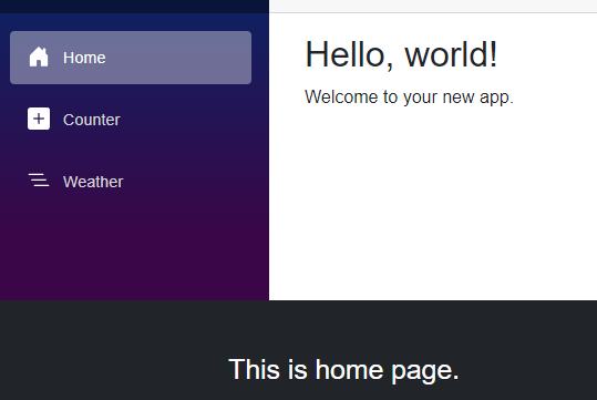
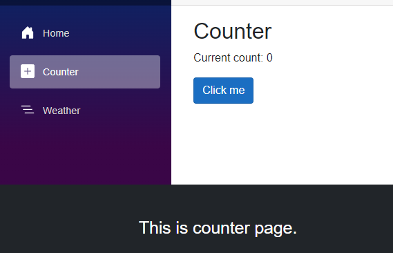
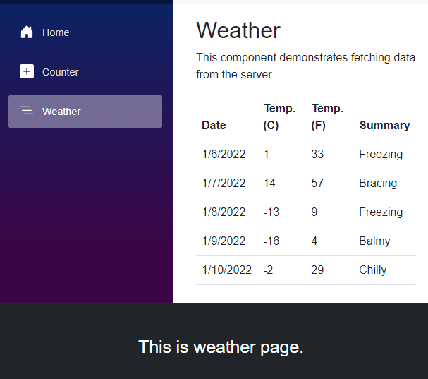
Our implementation is based on user navigation across different pages (Home, Counter, and Weather) and dynamically enables the footer to change and exhibit a custom message on each page. See our guide on routing and navigation in Blazor for more on how page navigation itself works.
Let’s check how the Home page will look like:
Next, we can check the Counter page:
And lastly, the Weather page:
To start the implementation, we import the namespaces the Section feature needs into the _Imports.razor file. That is the right place for them, because several pages and components use the same namespace, and one import there covers all of them:
@using Microsoft.AspNetCore.Components.Sections
We use the standard Blazor WebAssembly Standalone App project template, which runs entirely client-side under a single render mode, so SectionOutlet and SectionContent always resolve together. Then we modify the MainLayout.razor file to add the footer and add SectionOutlet within this footer:
<footer class="py-5 bg-dark">
   <div class="container">
       <div class="row">
           <div class="col-md-4">
               <p class="m-0 text-white"><SectionOutlet SectionName="CustomFooterSection" /></p>
           </div>
       </div>
   </div>
</footer>
We use the standard Bootstrap CSS library classes included in the project template to add a footer to the MainLayout page. We also add the SectionOutlet component and set the value for the SectionName property to CustomFooterSection. If we don’t want to use a named section, we can pass a static object with the SectionId parameter to identify the section. If we’d rather scope styles to a single component instead of relying on shared Bootstrap classes, see our guide to CSS isolation in Blazor.
Display Section in Custom Component
Once we’ve added the footer, we create a custom component to display the footer content (see our guide to Blazor components for the general pattern). To do this, we create a new folder called Components at the project level and add a new file called CustomFooter.razor, which is the component file:
<h3 class="text-center">@MessageText</h3>

@code {
    [Parameter]
    public required string MessageText { get; set; }
}
We create a MessageText property that renders itself as an HTML H3 tag.
Let’s use the component now in the SectionContent component on the Home page, following the exact implementation for the other two pages:
@page "/"
<SectionContent SectionName="CustomFooterSection">
    <CustomFooter MessageText="This is home page." />
</SectionContent>
<PageTitle>Home</PageTitle>

<h1>Hello, world!</h1>

Welcome to your new app.
We are nesting the CustomFooter component under the SectionContent component. The SectionName property has been set to CustomFooterSection, which matches the SectionOutlet component defined above. This pattern of nesting arbitrary content under a component is the same idea behind RenderFragment and the component lifecycle, except sections route the content to a named placeholder instead of a parameter. Repeat the same steps for the other two pages (Counter and Weather) and run the application to see the Sections in action.
| Parameter | On SectionOutlet | On SectionContent | Notes |
|---|---|---|---|
SectionName | Yes: string identifier | Yes: must match exactly | Case-sensitive; a typo fails silently |
SectionId | Yes: object identifier | Yes: must be the same instance | Use a static readonly object to avoid string typos |
| Both at once | Not allowed | Not allowed | Pick one addressing scheme per section |
| Namespace | Microsoft.AspNetCore.Components.Sections | same | Add to _Imports.razor once |
What Happens When Two Pages Target the Same Section?
Only one SectionContent can fill an outlet at a time, and the last one rendered wins. That sounds like a limitation and is actually the whole point: because a page’s SectionContent disappears when the user navigates away, each page gets to own the footer or toolbar for exactly as long as it is on screen, and the outlet falls back to empty when nothing claims it.
Where it does bite is when a page and one of its child components both target the same section. Render order decides the winner, and render order is not obvious from reading the markup, so the symptom is content that flickers or shows the wrong page’s toolbar.
The fix is a naming discipline rather than a code change: one owner per outlet. If a child component needs to contribute, give it its own outlet rather than competing for the parent’s. Microsoft’s reference says the reverse is not allowed: “Two or more SectionOutlet components can’t have the same SectionName or SectionId.”
Do Blazor Sections Work With Interactive Render Modes?
Yes, with one constraint that catches people out: the outlet and the content must end up in the same render mode.
Sections resolve inside a single component hierarchy at render time. When the layout is static server-rendered and the page declares @rendermode InteractiveServer, the two live in different rendering worlds, and the content never reaches the outlet: no exception, just an empty footer.
The practical rule is to put SectionOutlet in a layout that runs in the same mode as the pages filling it. In a globally interactive app, that is automatic. In an app that opts components into interactivity one at a time, the layout has to be interactive too.
Static server-side rendering works fine on its own, and it is a good fit for sections, since page-specific header and footer content usually needs no interactivity at all.
If a section renders in development and not in production, check the render mode before checking the name.
Microsoft’s sections reference states the constraint in one line: “A section that contains interactive components is statically rendered (non-functional) in a layout component in a Blazor Web App that adopts per-page/component rendering.”
Conclusion
“Sections” is a simple yet powerful feature for injecting and managing content across Blazor pages and components. They provide a way to structure and update content dynamically, especially in page navigation scenarios, and they simplify content management by allowing adaptable, context-specific footers and layouts across multiple pages.
Tested with .NET 10.0.10.