In our Blazor WebAssembly series, we’ve already talked about Forms and Form Validation. There we learned a lot about creating and validating forms but there is still more to it. In this article, we are going to extend that topic by introducing a custom validation in Blazor WebAssembly. We are going to learn how to add custom validation attributes and use them for our model objects. Also, we are going to see how to customize our error messages and how to customize the style of the input elements on the form.
Let’s get going.
Project Preparation with a Basic Validation
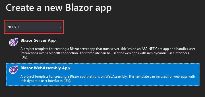
The first thing we are going to do is to create a new Blazor WebAssembly project named CustomValidation:
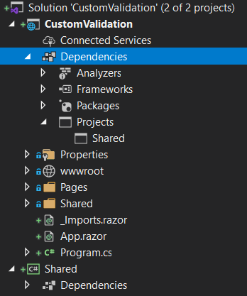
As soon as we create it, we are going to create a new Class Library project, name it Shared and reference it from the main project:
Now, let’s install the required library for the validation in the Shared project:
PM> Install-Package System.ComponentModel.Annotations
And create a new Product model in the same project:
public class Product
{
    [Required]
    public string Name { get; set; }
    [Required]
    public string Supplier { get; set; }
}
After this, we can go back to the main project and just modify the Index.razor file:
@page "/"

<EditForm Model="_product" OnValidSubmit="Submit" style="width:600px;">
    <DataAnnotationsValidator />
    <div class="form-group row">
        <label for="name" class="col-md-2 col-form-label">Name:</label>
        <div class="col-md-10">
            <InputText id="name" class="form-control" @bind-Value="_product.Name" />
            <ValidationMessage For="@(() => _product.Name)" />
        </div>
    </div>

    <div class="form-group row">
        <label for="supplier" class="col-md-2 col-form-label">Supplier:</label>
        <div class="col-md-10">
            <InputText id="supplier" class="form-control" @bind-Value="_product.Supplier" />
            <ValidationMessage For="@(() => _product.Supplier)" />
        </div>
    </div>

    <div class="row">
        <div class="col-md-12 text-right">
            <button type="submit" class="btn btn-success">Submit</button>
        </div>
    </div>
</EditForm>
Everything about this code is explained in our Forms and Form Validation in Blazor WebAssembly article, so we won’t be explaining anything here.
Let’s just create a new Index.razor.cs file in the Pages folder and modify it:
public partial class Index
{
    private Product _product = new Product();

    public void Submit() =>
        Console.WriteLine($"{_product.Name}, {_product.Supplier}");
}
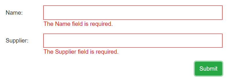
That’s it. We can start the application and as soon as the Index page is up, we can press the Submit button:
And there we go. We have our validation in place. Now that we have it, we can customize it.
Adding Custom Validation in Blazor WebAssembly with Custom Validation Attributes
There are a lot of validation attributes provided with the Annotations library, but sometimes a new rule emerges that is not supported. For these kinds of rules, we have to create a custom attribute and apply it to our model class.
That said, let’s see how to do exactly that.
For example, let’s say we want to restrict the user to enter only the Code-Maze value for the Supplier field.
To do that, first, we have to create a new SupplierValidationAttribute class in the Shared project:
public class SupplierValidationAttribute : ValidationAttribute
{
    public string ValidSupplierValue { get; set; }

    protected override ValidationResult IsValid(object value, ValidationContext validationContext)
    {
        var lowerValue = value.ToString().ToLower();
        if (lowerValue.Equals(ValidSupplierValue.ToLower()))
            return null;

        return new ValidationResult(ErrorMessage, new[] { validationContext.MemberName });
    }
}
As we can see, this class inherits from the ValidationAttribute abstract class, which is the base class for the validation attributes. Then, we have a single ValidSupplierValue property, which we can set from the model class when calling this attribute. After the property creation, we have to override the IsValid method that accepts two parameters. The value parameter will hold the value the user enters in the input field. The validationContext parameter describes the context in which we perform the validation.
The logic inside the method is pretty simple. We first convert the object value to a string and make it lowercase. Then we do a comparison between that value and our restricted property value. If they are the same, we just return null. Otherwise, we return a new ValidationResult with the provided ErrorMessage and a member name.
After this, we can return to the Product class and use this attribute:
public class Product
{
    [Required]
    public string Name { get; set; }
    [Required]
    [SupplierValidation(ErrorMessage = "Wrong value entered", ValidSupplierValue = "Code-Maze")]
    public string Supplier { get; set; }
}
So, we use the SupplierValdiation attribute and provide values for the ErrorMessage and ValidSupplierValue properties.
Testing
To test this, we can start the application and click the Submit button. As soon as we do that, we are going to see the same result as before. So the Required rule is applied for both input fields.
Now, let’s try entering the wrong value in the Supplier field:
We can see our custom validation attribute kicks in immediately.
Also if we enter a correct value and press the submit button, we are going to see the result in the Console window:
Excellent.
Let’s move on.
Custom Validation Error Messages
Sometimes we want to add different styling to error messages by using a class from bootstrap or any other CSS library. Right now we can’t do that.
If we inspect the code of the ValidationMessage component (for the full source code, visit this link), we can find the BuildRenderTree method where the class that styles the message is hardcoded:
protected override void BuildRenderTree(RenderTreeBuilder builder)
{
    foreach (var message in CurrentEditContext.GetValidationMessages(_fieldIdentifier))
    {
        builder.OpenElement(0, "div");
        builder.AddMultipleAttributes(1, AdditionalAttributes);
        builder.AddAttribute(2, "class", "validation-message");
        builder.AddContent(3, message);
        builder.CloseElement();
    }
}
This means that any class we try to send to the ValdiationMessage component will be overridden by the validation-message class. We can find this class in the wwwroot/css/app.css file:
.validation-message {
    color: red;
}
Of course, we can always modify this class to add different styles. But that’s all we can do. As we said, we can’t provide a different class to the ValidationMessage component.
Well, we can’t with the default component design, but we are going to show you how to override it.
If we inspect the implemented ValidationMessage class, we can see the logic behind it. Of course, this class has a lot of logic that we don’t require here, but we are going to use some of its parts.
So, let’s start by creating a new MessageValidatorBase class in the main project and modifying it:
public class MessageValidatorBase<TValue> : ComponentBase, IDisposable
{
    private FieldIdentifier _fieldIdentifier;
    private EventHandler<ValidationStateChangedEventArgs> _stateChangedHandler
        => (sender, args) => StateHasChanged();

    [CascadingParameter]
    private EditContext EditContext { get; set; }
    [Parameter]
    public Expression<Func<TValue>> For { get; set; }
    [Parameter]
    public string Class { get; set; }

    protected IEnumerable<string> ValidationMessages =>
        EditContext.GetValidationMessages(_fieldIdentifier);

    protected override void OnInitialized()
    {
        _fieldIdentifier = FieldIdentifier.Create(For);
        EditContext.OnValidationStateChanged += _stateChangedHandler;
    }

    public void Dispose()
    {
        EditContext.OnValidationStateChanged -= _stateChangedHandler;
    }
}
For this to work, we require some using directives:
using Microsoft.AspNetCore.Components;
using Microsoft.AspNetCore.Components.Forms;
using System;
using System.Collections.Generic;
using System.Linq.Expressions;
Explaining the Logic Behind this Class.
Our class inherits from the ComponentBase class and IDisposable interface as the ValidationMessage class does. Then we have a private _fieldIdentifier field to identify the field that we can edit. Also, we have a single event that does only one thing – calls StateHasChanged.
We have a couple of properties – EditContext, For, Class, and ValidationMessages. The EditContext property is a cascading parameter that provides the main support for the validation logic. The For property is a parameter of type Expression<Func<TValue>> that we are going to use to specify a field for which we want to display a validation message. We use the Class property that will accept the name of the class(es) we want to use for the message styling. Lastly, we store all the validation messages from EditContext inside the ValidationMessages property.
As soon as our component initializes, we initialize the _fieldIdentifier field by using the FieldIdentifier.Create method that accepts a single For parameter. And also, attach our method to the OnValdiationStateChanged event. This means every time the validation state changes we are going to call the StateHasChanged method to re-render the page.
Finally, in the Dispose method, we have to clean after ourselves.
Excellent.
Now, we can use this base class in our custom validation component.
Creating a Custom Validation Component
Let’s start by creating a new Components folder in the main project and the CustomValidationMessage component inside it:
@typeparam TValue
@inherits MessageValidatorBase<TValue>

@foreach (var message in ValidationMessages)
{
    <div class="@Class">
        @message
    </div>
}
All we do here is inherit from the MessageValidatorBase class and iterate through each message from the ValidationMessages collection. For each message we find, we display it and use a provided class name(s) to style it.
And that’s all.
Let’s just modify the Index.razor file, to apply this component instead of the ValidationMessage component:
<div class="form-group row">
    <label for="supplier" class="col-md-2 col-form-label">Supplier:</label>
    <div class="col-md-10">
        <InputText id="supplier" class="form-control" @bind-Value="_product.Supplier" />
        <CustomValidationMessage For="@(() => _product.Supplier)"
            Class="alert alert-danger mt-1 py-1 text-center" />
    </div>
</div>
And we need a using statement inside the _Imports.razor file:
@using CustomValidation.Components
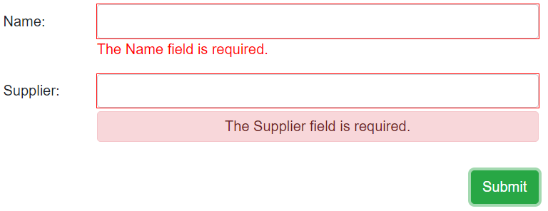
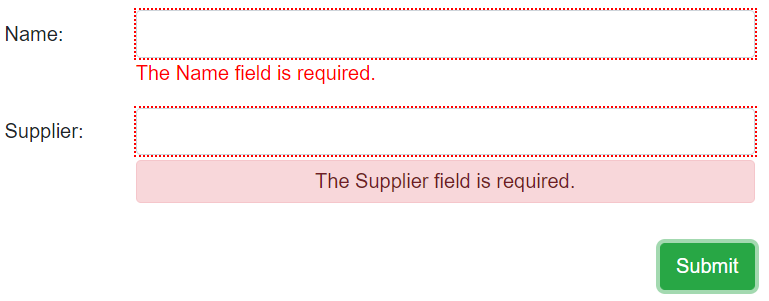
Now, we can test our form:
And there we go.
We can see our custom styled message.
Modifying Validation Styles for Input Elements
The last thing we are left to do is to customize the styles for the input fields. We are going to show you how to do that for both valid and invalid fields.
So, let’s continue on.
To support this, we can’t use the Model property in the EditForm component. We have to modify this by introducing the EditContext:
<EditForm EditContext="_editContext" OnValidSubmit="Submit" style="width:600px;">
Now, we have to modify the Index.razor.cs file, to support the validation with EditContext:
public partial class Index : IDisposable
{
    private Product _product = new Product();
    private EditContext _editContext;

    protected override void OnInitialized()
    {
        _editContext = new EditContext(_product);
        _editContext.OnFieldChanged += HandleFieldChanged;
    }

    private void HandleFieldChanged(object sender, FieldChangedEventArgs e)
    {
        _editContext.Validate();
        StateHasChanged();
    }

    public void Submit() =>
        Console.WriteLine($"{_product.Name}, {_product.Supplier}");

    public void Dispose()
    {
        _editContext.OnFieldChanged -= HandleFieldChanged;
    }
}
We create a private _editContext field and as soon as the component initializes, we initialize it with a model parameter. Also, we attach the HandleFieldChanged method to the OnFieldChanged event that raises every time the field value changes. Furthermore, we have the HandleFieldChanged method where we call the Validate method to validate EditContext, and call the StateHasChanged method to re-render the component.
Finally, we need the Dispose method to remove the HandleFieldChanged method from the event.
At this point, our validation should work as before.
Adding FieldCssClassProvider
To support the styling of our HTML elements, we need to create a new class in the main project:
public class ValidationFieldClassProvider : FieldCssClassProvider
{
    private readonly string _validClass;
    private readonly string _errorClass;

    public ValidationFieldClassProvider(string errorClass, string errorClass)
    {
        _validClass = validClass;
        _errorClass = errorClass;
    }

    public override string GetFieldCssClass(EditContext editContext, in FieldIdentifier fieldIdentifier)
    {
        var hasMessages = !editContext.GetValidationMessages(fieldIdentifier).Any();

        return hasMessages ? _validClass : _errorClass;
    }
}
We inherit from the FieldCssClassProvider class that supplies information about the class names, we want to apply to our fields, and the validation state of EditContext. Then we have two fields for valid and error class names. Also, we have to override the GetFieldCssClass method where we check for any validation messages inside EditContext and conditionally return the class name we want to apply to the field.
Good, with this in place, we have to slightly modify the Index.razor.cs class:
protected override void OnInitialized()
{
    _editContext = new EditContext(_product);
    _editContext.SetFieldCssClassProvider(new ValidationFieldClassProvider("validField", "invalidField"));
    _editContext.OnFieldChanged += HandleFieldChanged;
}
And finally, let’s add the validField and invalidField classes in the app.css file:
.invalidField {
    outline: 2px dotted red;
}

.validField {
    outline: 1px dashed blue;
}
That’s it.
Let’s start the app:
And we can see a different style for the valid fields.
Of course, if we click the Submit button:
We can see a different style.
Awesome.
Everything works like a charm.
Conclusion
In this article, we have learned:
- How to apply a custom validation in Blazor WebAssembly with custom validation attributes
- How to modify the styles of the validation messages
- And how to modify the styles of the fields on our form
Until the next article.
Best regards.


