Blazor components are reusable parts of the application containing the logic for the user interface creation. So, everything in our application could be a component. A home page, registration, login form, error page, you name it. It’s recommended to always use components to split the application’s logic into smaller reusable/maintainable parts.
In this article, we are going to learn about creating components and how to pass different kinds of parameters to them. Additionally, we are going to learn how to debug the Blazor WebAssembly application using our browser.
For the complete navigation for this series, you can visit the Blazor WebAssembly Series page.
Now, it’s time to dive into the project.
Working With Blazor Components
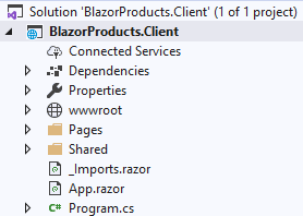
Let’s start by creating a new Blazor WebAssembly application as we did in the previous article. We are going to name it BlazorProducts.Client:
While creating this project, you can find the “ASP.NET Core hosted” checkbox on the lower-right side of the window. By checking this checkbox, Visual Studio creates an additional Razor project for our client project automatically. We didn’t check it because we want to create only the client side project. Later on, we will create our separate Web API project.
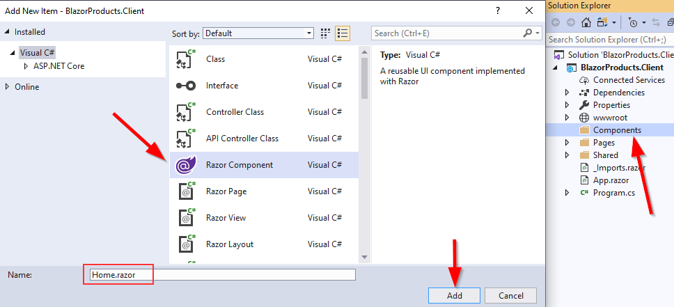
That said, let’s continue by creating a new Components folder at the root of the project. Then, let’s right-click on that folder and choose Add New Item. In the new window, we are going to choose the Razor Component option, and name it Home.razor:
As soon as we create this component, we are going to see it consists of two parts:
- HTML part <h3>Home</h3> and
- The @code part
In the HTML part, we are going to add the UI code and in the @code part, we are going to write the C# code. A component doesn’t require the @code part to be a valid component, it can run without it for sure. But when we want to use fields, properties, methods, and the C# business logic overall, it is the best practice to add them to the @code block and separate them from the markup logic.
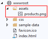
Now, let’s add the assets folder in the wwwroot folder and inside it a single picture (you can use any picture you want):
Then, let’s modify the Home.razor file:
<div style="text-align:center">
    <h1>
        Welcome to the BlazorProducts.Client application.
    </h1>
    <p>
        Feel free to
        <a href="https://www.redbubble.com/people/vpecanac/works/44764889-code-maze-merch?asc=u" target="_blank">visit our shop</a>
        any time you want.
    </p>
    <p>
        <img src="/assets/products.png" alt="products image for the Home component" class="img-fluid" />
    </p>
</div>

@code {

}
Now, we can open the Index.razor file, remove everything from it except the @page directive and apply our newly created component:
@page "/"
@using BlazorProducts.Client.Components

<Home></Home>
We apply the @using directive in this file because we are going to use the Home component only in this file. But, if we want to share our component with multiple files, we can apply the using directive in the _Imports.razor file.
Additionally, to add the component to another file, we use a tag syntax with the name of the component.
That’s all it takes. But before we start our application, let’s remove the IIS profile from the launchSettings.json file:
{
  "profiles": {
    "BlazorProducts.Client": {
      "commandName": "Project",
      "dotnetRunMessages": "true",
      "launchBrowser": true,
      "inspectUri": "{wsProtocol}://{url.hostname}:{url.port}/_framework/debug/ws-proxy?browser={browserInspectUri}",
      "applicationUrl": "https://localhost:5001;http://localhost:5000",
      "environmentVariables": {
        "ASPNETCORE_ENVIRONMENT": "Development"
      }
    }
  }
}
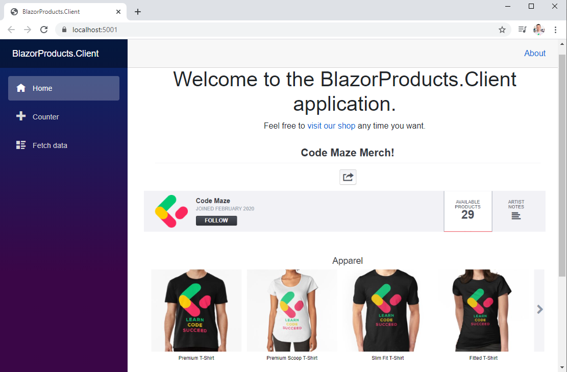
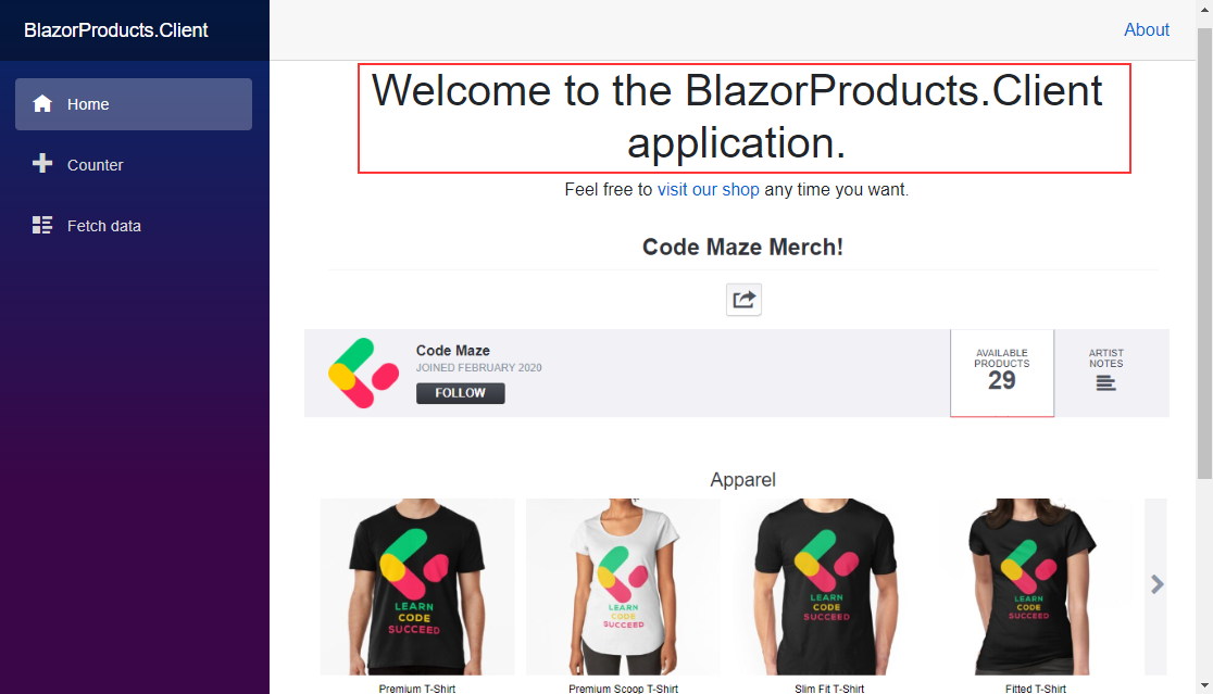
Excellent. Now, let’s start our application:
There we go. We can see our application is working and our component is displayed on the page.
But, this is just a part of the whole Blazor Components story. So, let’s move on.
Sending Parameters to the Blazor Components
Often, we need to create reusable components that accept different parameters and show content based on those parameters. So, to show how to do that, let’s modify our Home component:
<div style="text-align:center">
    <h1>
        @Title
    </h1>
    <p>
        Feel free to
        <a href="https://www.redbubble.com/people/vpecanac/works/44764889-code-maze-merch?asc=u" target="_blank">visit our shop</a>
        any time you want.
    </p>
    <p>
        <img src="/assets/products.png" alt="products image for the Home component" class="img-fluid" />
    </p>
</div>

@code {
    [Parameter]
    public string Title { get; set; }
}
With the @Title expression, we are using a one-way binding to bind the value from the Title property (from the @code section) to the HTML. As we can see, if we want to mark any property as a component parameter, we have to decorate it with the [Parameter] attribute.
We can use different kinds of data for the parameters, even events, and the razor code. It depends on the usage of our component and what we want to accomplish with the component parameters. Take note that we are explicitly stating “component parameters” because we have the routing parameters as well.
We are going to talk more about them in the next article.
Now, to complete the process, we have to modify the Index page:
@page "/"
@using BlazorProducts.Client.Components

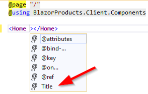
<Home Title="Welcome to the BlazorProducts.Client application."></Home>
To send the value to the Title property in the Home component, we use the Title attribute. Blazor provides us a nice IntelliSense for that:
After this change, we can start our application again, and inspect the result:
We can see that nothing has changed in the UI. But now, we are using component parameters to display the Title.
Arbitrary Parameters in Blazor Components
Blazor components can accept additional attributes that are not declared as the component parameters. For example, our component has an image tag with the src and alt attributes hardcoded. But if we want to reuse this whole component, we have to provide the user with the possibility to add their picture with the alternative text.
In the previous section, we used the [Parameter] attribute to send a parameter that is related to the component itself. But now, we have two attributes related to the img tag inside the component. So, there is a better way to pass these attributes to the component using Arbitrary Parameters.
Let’s remove the src and alt attributes from the image tag and add a parameter in the Home component:
<div style="text-align:center">
    <h1>
        @Title
    </h1>
    <p>
        Feel free to
        <a href="https://www.redbubble.com/people/vpecanac/works/44764889-code-maze-merch?asc=u" target="_blank">visit our shop</a>
        any time you want.
    </p>
    <p>
        <img class="img-fluid" />
    </p>
</div>

@code {
    [Parameter]
    public string Title { get; set; }

    [Parameter(CaptureUnmatchedValues = true)]
    public Dictionary<string, object> AdditionalAttributes { get; set; }
}
This parameter implements Dictionary<string, object> type and it has an additional CaptureUnmatchedValues property. With this property, if it’s set to true, we state that this parameter shall handle all the values that don’t match any other parameter in this component.
To apply this, we have to add @attributes attribute to the image tag:
<p>
    <img @attributes="AdditionalAttributes" class="img-fluid" />
</p>
And send the values from the Index page:
@page "/"
@using BlazorProducts.Client.Components

<Home Title="Welcome to the BlazorProducts.Client application."
      src="/assets/products.png" alt="products image for the Home component"></Home>
Now, we can start the application and verify that everything is working as it supposed to. But let’s improve this solution a bit. Let’s create a new property in the Index page and use it to send our attributes to the Home component:
@page "/"
@using BlazorProducts.Client.Components

<Home Title="Welcome to the BlazorProducts.Client application." @attributes="AdditionalAttributes"></Home>

@code{
    public Dictionary<string, object> AdditionalAttributes { get; set; } = new Dictionary<string, object>
    {
        { "src", "/assets/products.png" },
        { "alt", "products image for the Home component" }
    };
}
With this solution, we can add more attributes in a more readable way. As a result, we can see those arbitrary parameters are useful when we define a component with a markup element that supports a variety of customizations.
Cascading Parameters
In some situations, we want to pass a parameter from a parent component to all the child components. To do that, we can use Cascading Parameters.
Let’s see how this works with an example.
First, let’s open the Shared/MainLayout.razor file and add some modifications to it:
@inherits LayoutComponentBase

<div class="page">
    <div class="sidebar">
        <NavMenu />
    </div>

    <div class="main">
        <div class="top-row px-4">
            <a href="http://blazor.net" target="_blank" class="ml-md-auto">About</a>
        </div>

        <div class="content px-4">
            <CascadingValue Value="@_color">
                @Body
            </CascadingValue>
        </div>
    </div>
</div>

@code {
    private readonly string _color = "#0505b5";
}
This is the layout component that renders all our project pages inside the @Body part. To apply the cascading parameter, we have to wrap the @Body content inside the CascadingValue component and pass a value with the Value attribute. We want to use this parameter inside the Home component, so let’s modify it as well:
<div style="text-align:center">
    <h1 style="color: @Color">
        @Title
    </h1>
    <p>
        Feel free to
        <a href="https://www.redbubble.com/people/vpecanac/works/44764889-code-maze-merch?asc=u" target="_blank">visit our shop</a>
        any time you want.
    </p>
    <p>
        <img @attributes="AdditionalAttributes" class="img-fluid" />
    </p>

</div>

@code {
    [Parameter]
    public string Title { get; set; }

    [Parameter(CaptureUnmatchedValues = true)]
    public Dictionary<string, object> AdditionalAttributes { get; set; }

    [CascadingParameter]
    public string Color { get; set; }
}
In the @code part, we add the Color property with the [CascadingParameter] attribute. This attribute specifies that the Color property should receive a value from the CascadingValue component. After that, we just modify the style of our h1 tag. Additionally, when we want to pass more than one value as a cascading parameter, we can create a new object with multiple properties and pass that object with the Value attribute to all the child components.
We have to mention that here we use cascading values by type. For this to work, several conditions must be fulfilled:
- We must decorate the
Colorproperty with theCascadingParameterattribute - It must have a setter and be public
- Its type must be the same as the type in the
CascadingValuecomponent (in this example of type string)
Now, if we inspect our result, we can see the h1 color is modified:
Next to the cascading values by type, which we just used, we can use the cascading values by name. For that, we have to add a new Name attribute to the CascadingValue component:
<CascadingValue Name="HeadingColor" Value="@_color">
    @Body
</CascadingValue>
Also, we have to modify the CascadingParameter attribute:
[CascadingParameter(Name = "HeadingColor")]
public string Color { get; set; }
The name of the property (Color) that consumes the value is irrelevant here. The Blazor is going to look for the property that has the CascadingParameter attribute with the Name property the same as the Name property in the CascadingValue component.
Debugging Blazor WebAssembly Applications
From the BlazorWebAssembly preview 3, there is a possibility to debug the Blazor client application using the Visual Studio IDE. To enable it, we have to use the Blazor WebAssembly project template preview 3 or later, and the latest preview release of Visual Studio 2019 16.6 (preview 2 or later).
With these in place, as soon as we inspect the launchSettings.json file, we are going to find a new inspectUri property. It enables IDE to identify that our application is the Blazor WebAssembly application and to instruct the debugging infrastructure to connect the browser through Blazor’s debugging proxy:
{
  "profiles": {
    "BlazorProducts.Client": {
      "commandName": "Project",
      "dotnetRunMessages": "true",
      "launchBrowser": true,
      "inspectUri": "{wsProtocol}://{url.hostname}:{url.port}/_framework/debug/ws-proxy?browser={browserInspectUri}",
      "applicationUrl": "https://localhost:5001;http://localhost:5000",
      "environmentVariables": {
        "ASPNETCORE_ENVIRONMENT": "Development"
      }
    }
  }
}
All we have to do is to set a breakpoint in our C# code and start the application with debugging support (F5). The rest of the process is the same.
Debugging in the Browser
Additionally, we can always debug our Blazor WebAssembly application in a browser.
Important Note: If you are using .NET Core 3.1, you can proceed with the following example. But if you are using .NET 5 or above, before you start with the example below, you have to modify the launchSettings.json file by setting the launchBrowser property to false. This will prevent the “WebSocket disconnected” error. After that, you can continue with the debugging example.
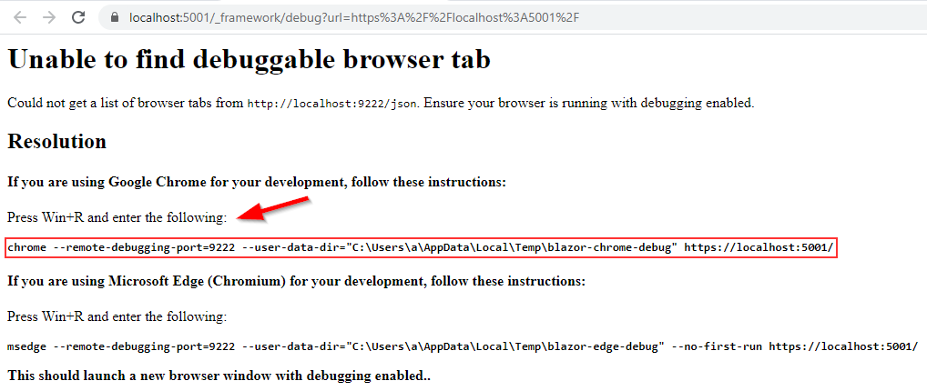
To do that, let’s start our application (F5), and as soon as the application starts in the browser, press the Shift+Alt+D keys. This should open a new tab with the instruction messages:
So, let’s do as it states for the Google Chrome browser because we are using it for this series.
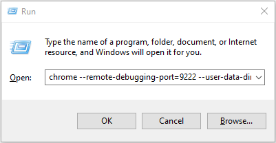
We have to copy the marked command and paste it into the Run window and press the OK button:
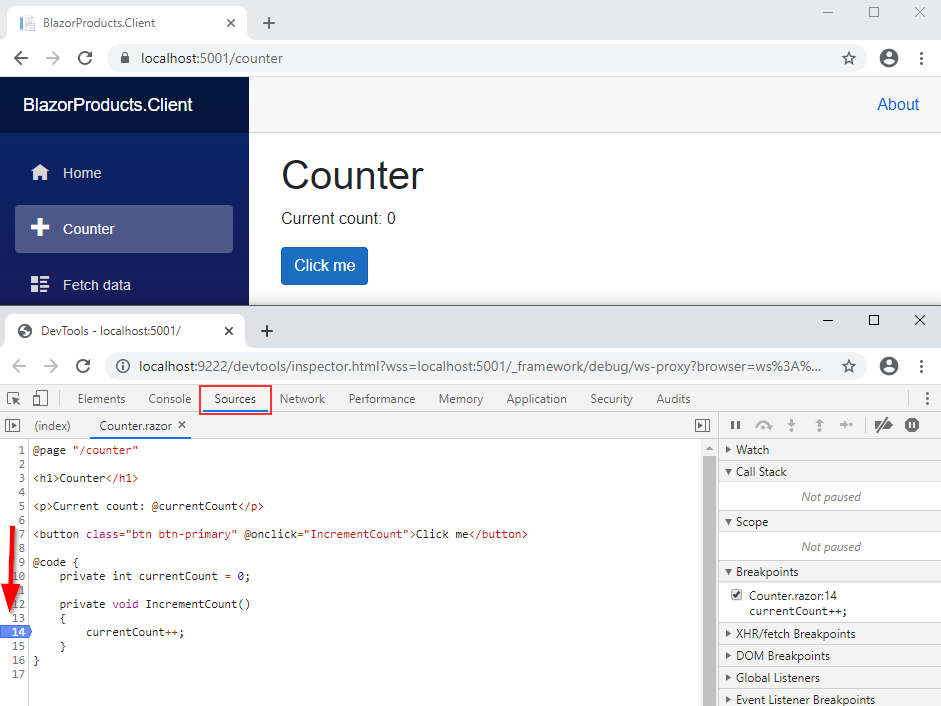
As soon as we do that, a new browser window will open with our application. All we have to do is to press again the Shift+Alt+D keys and the DevTools tab will open. Let’s navigate to the Source tab and press Ctrl+P, type Counter, and press the Enter key. This will open the Counter razor file for us and we can place a breakpoint at the code line we want to debug:
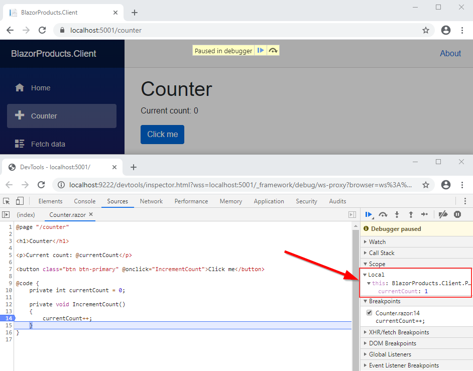
Now, we can click the Click me button and that is going to trigger our breakpoint. Once we press F10, the process will move to another line and in the Local tab, we can inspect the value of the currentCount variable:
And, that’s all it takes. We can debug our application and inspect the results as well.
Conclusion
In this article, we have learned:
- How to create Blazor components
- The way to use parameters to pass different values to the component
- How to use Cascading parameters to share parameters between multiple child components
- And the way to debug our client application
In the next article, we are going to learn about the Partial classes, RenderFragment parameters, and the Lifecycle methods in the Blazor applications.


